


Chicago Fire FC
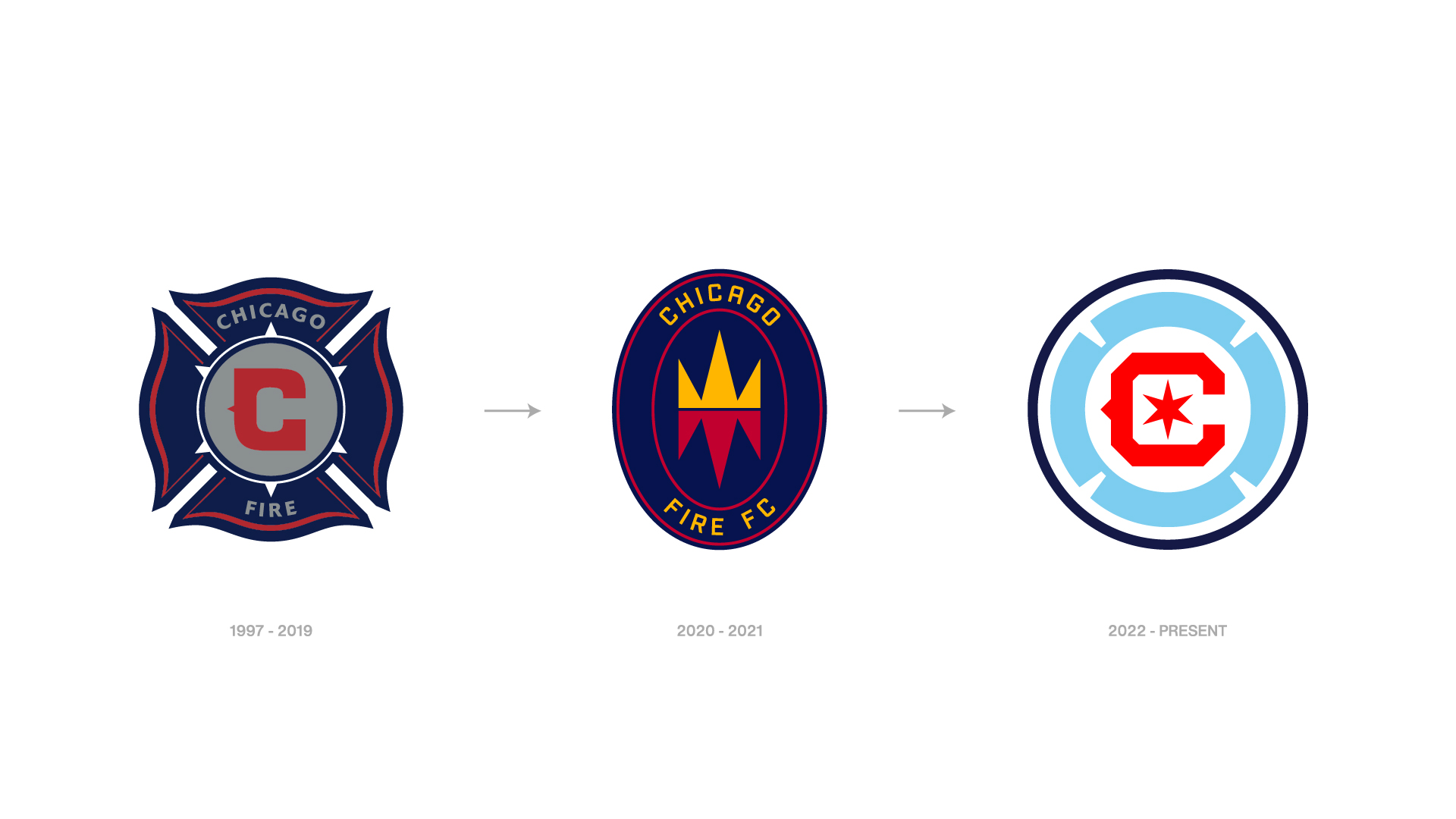
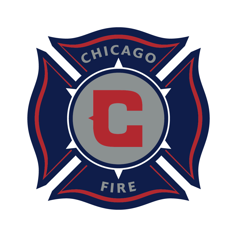
Full brand redesign for Chicago Fire FC, an historic Major League Soccer franchise.
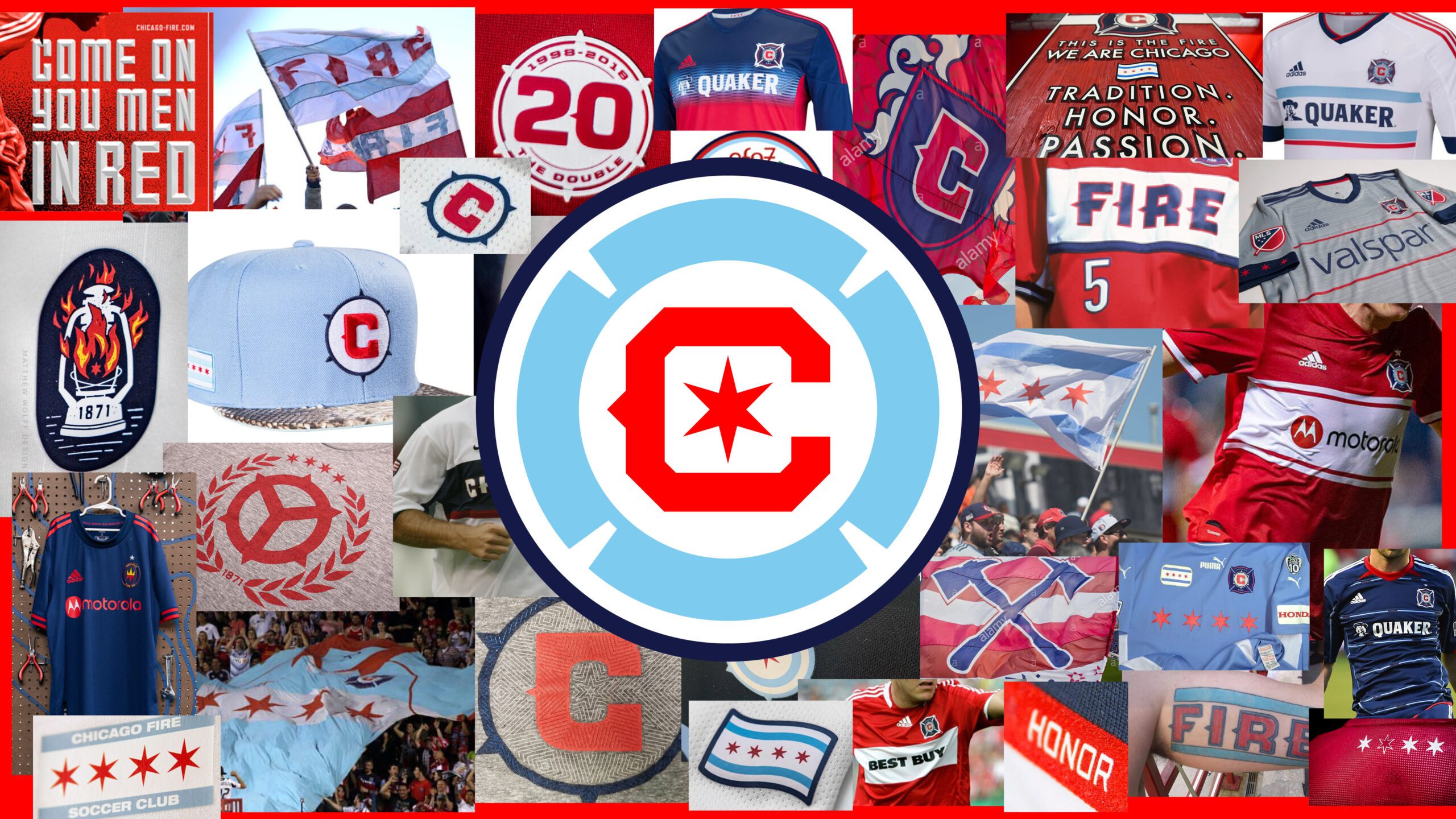
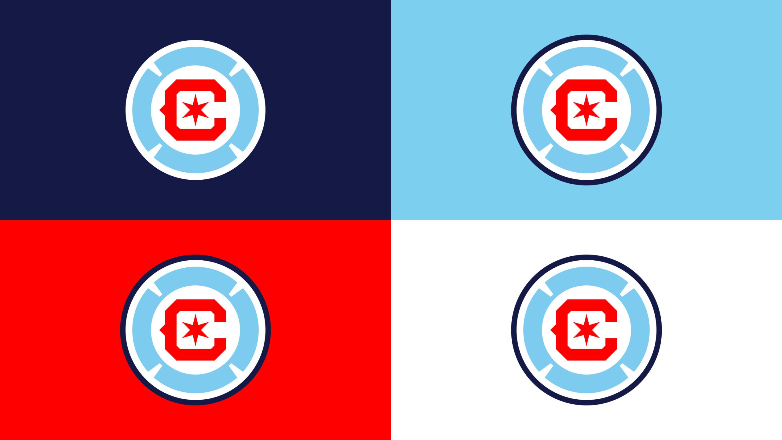
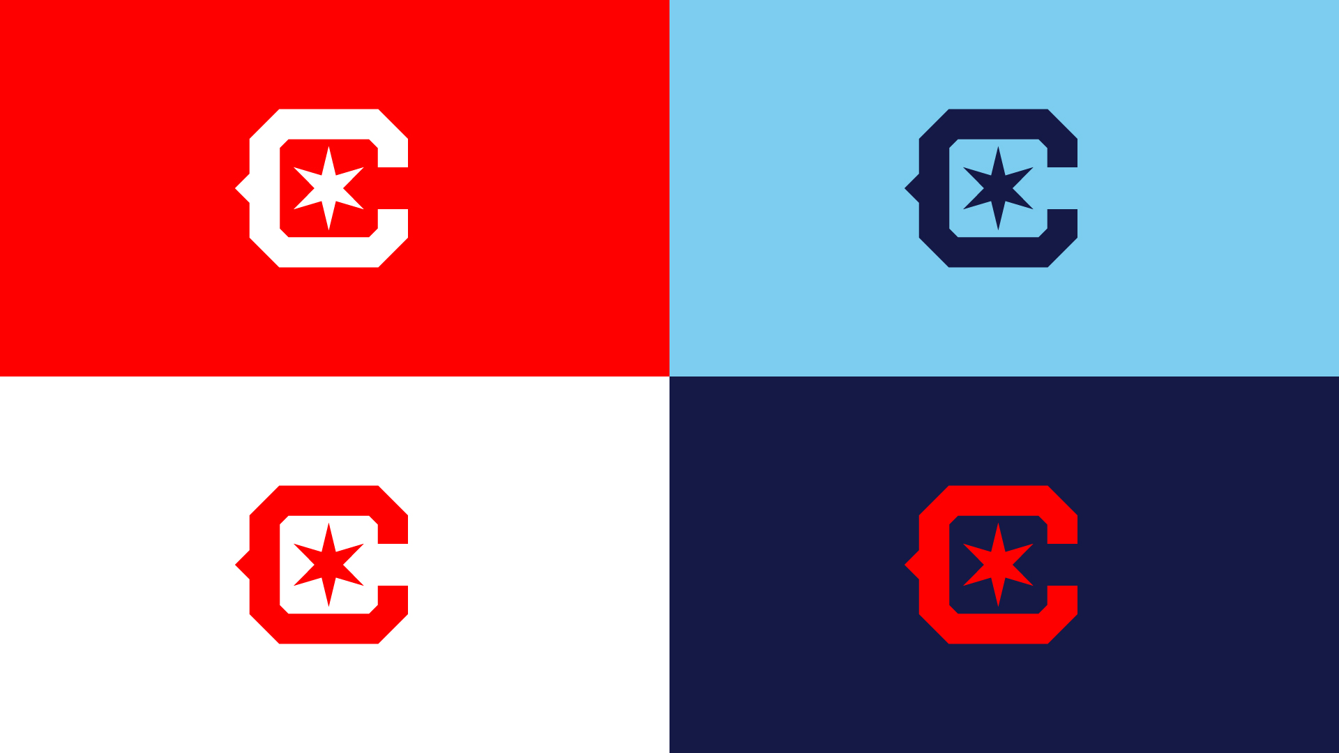
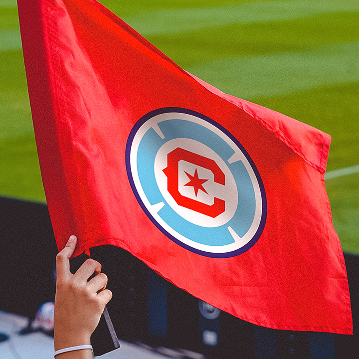
The crest’s core elements — the six-pointed star, the letter C, the florian cross, and the Chicago city flag colors — were drawn from the collective voice of Fire fans through 500+ hours of roundtables, 225,000+ words in website submissions, 10,000+ social media responses, and dozens of surveys. We heard voices from every neighborhood in Chicago and 152 cities across Illinois.
The new look was unveiled ahead of the 2022 MLS season. Learn more about this unique fan-first process here.
DELIVERABLES
- Primary crest
- Secondary marks
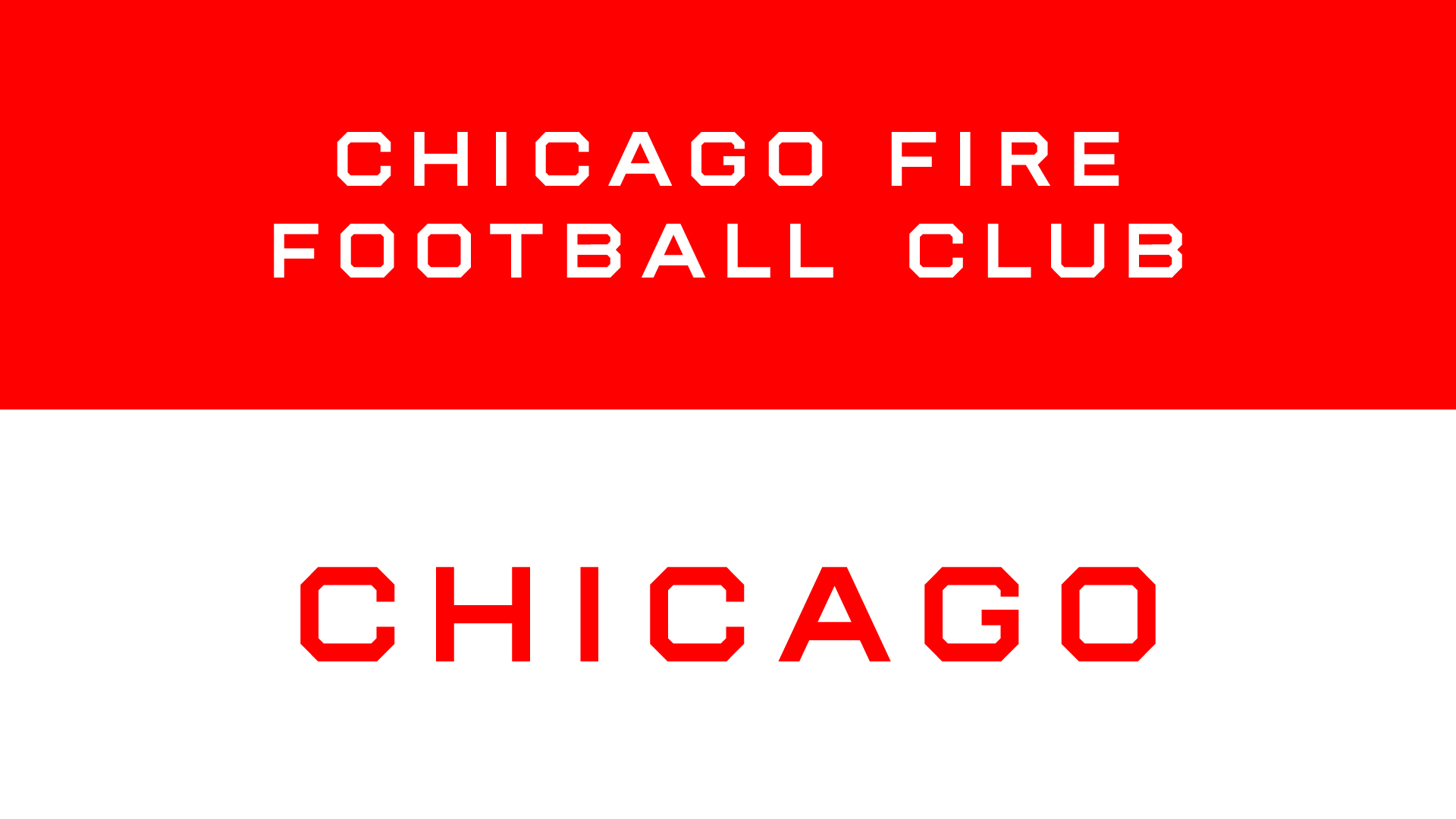
- Wordmarks
- Color scheme
- 25th anniversary logo
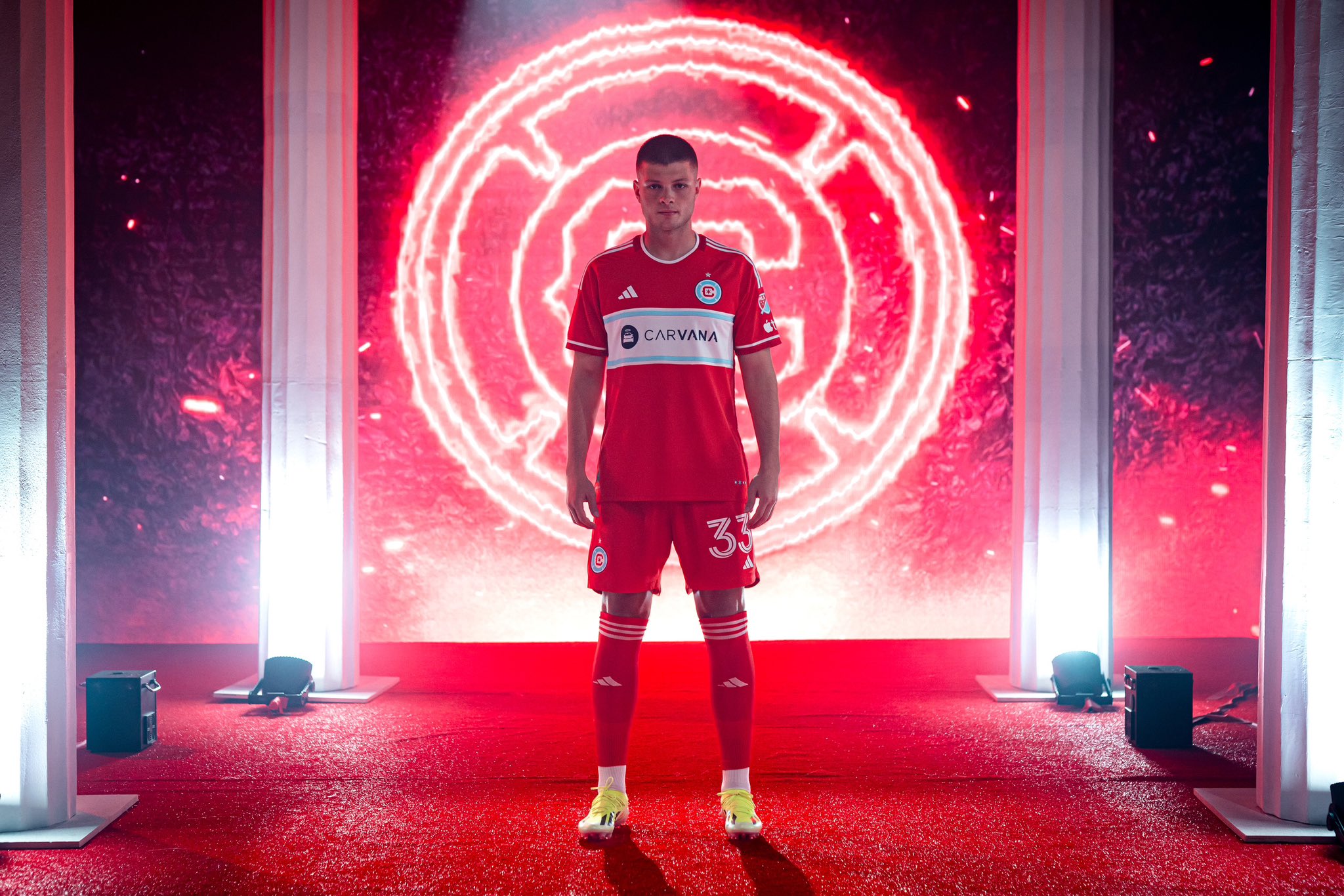
- Kit strategy/creative direction
LAUNCH DATE
June 2021
MORE WORK


