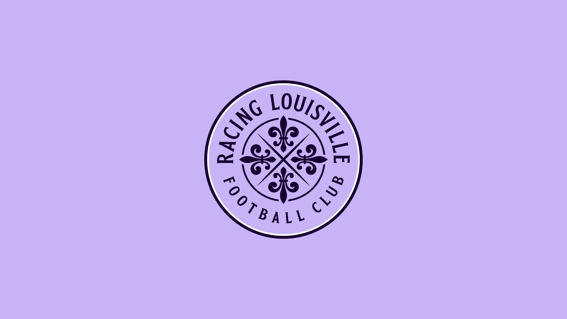

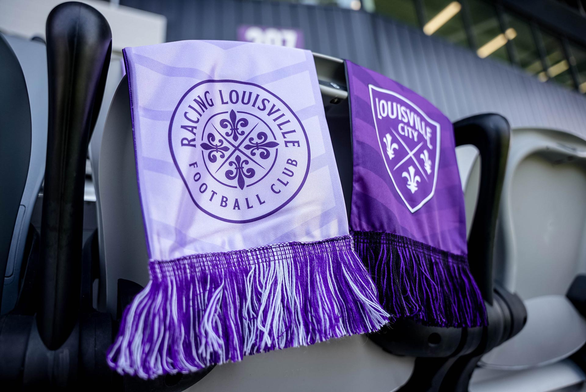
Racing Louisville Football Club
Full brand identity for Racing Louisville Football Club, an expansion National Women’s Soccer League club in Louisville, Kentucky.
Our objective was to create a unique brand identity that reflected the city of Louisville, and represented one of the top professional women’s soccer clubs in the country.
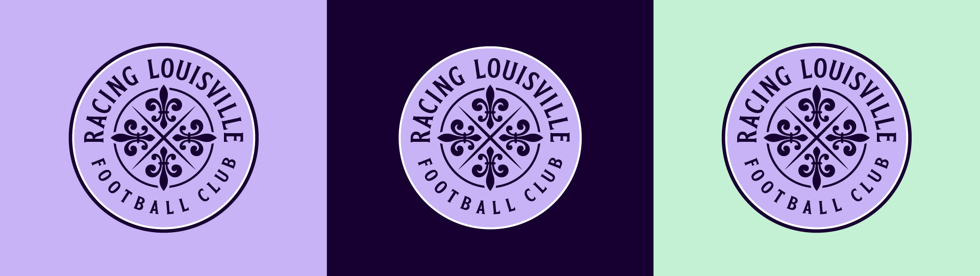
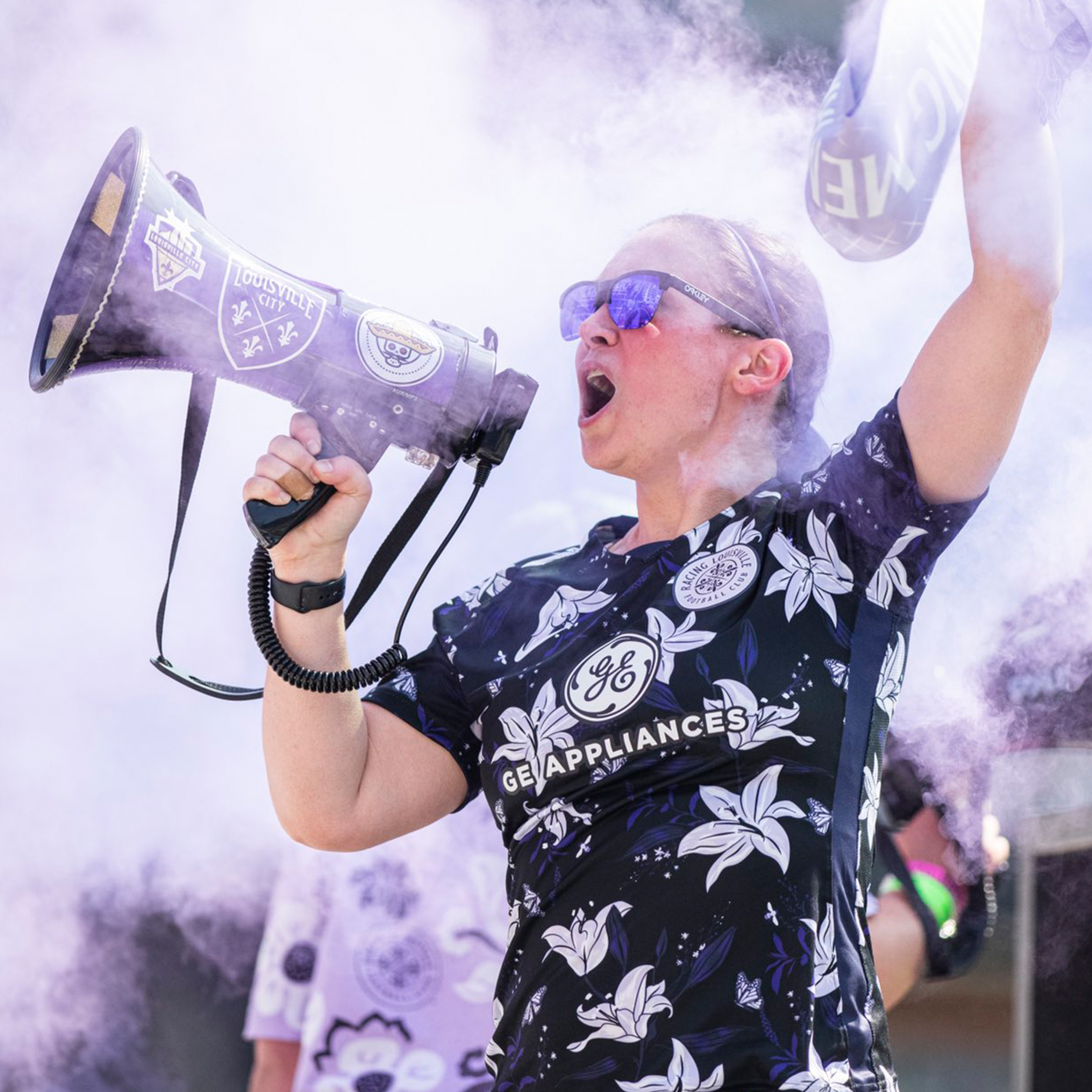
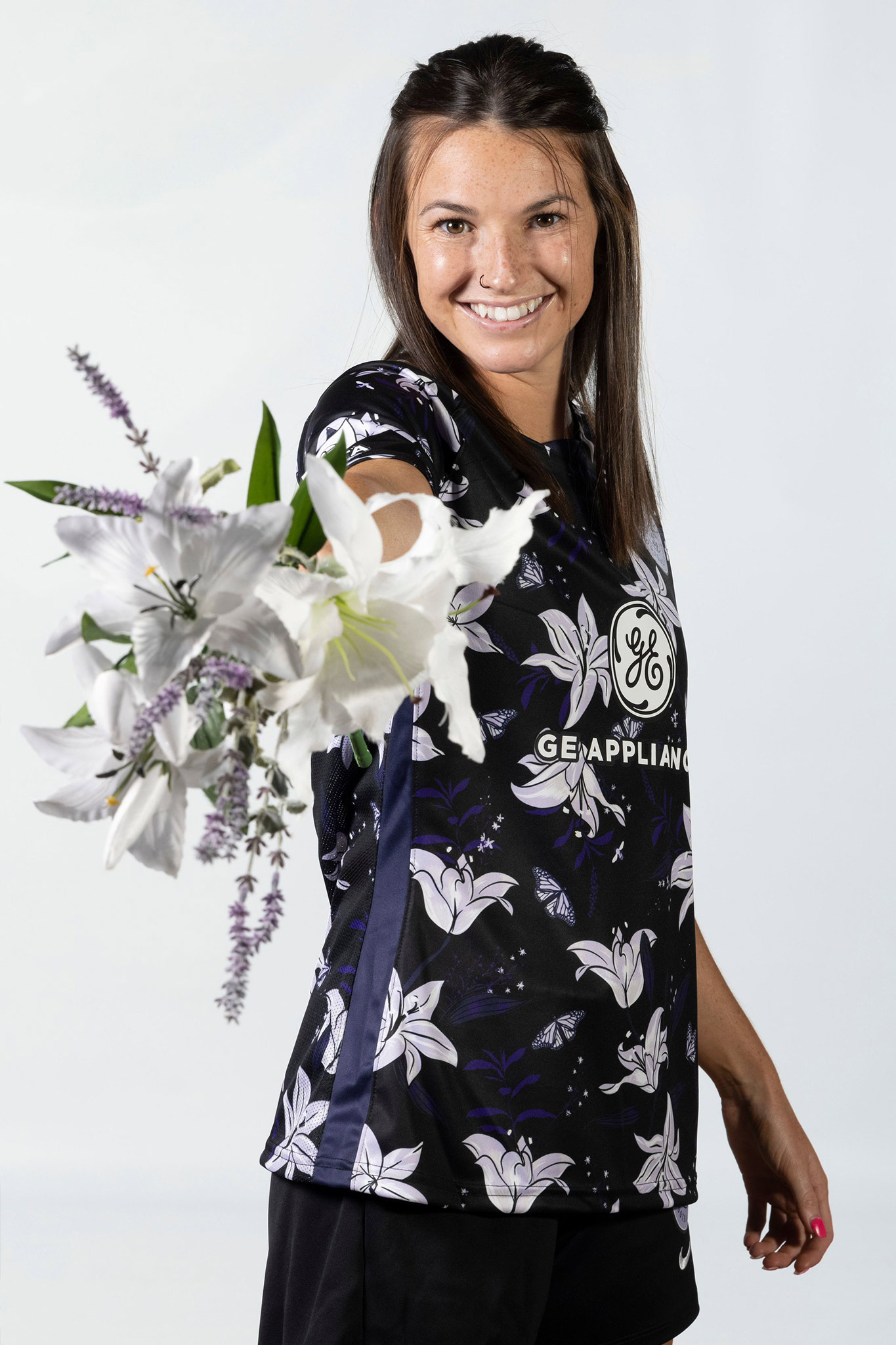
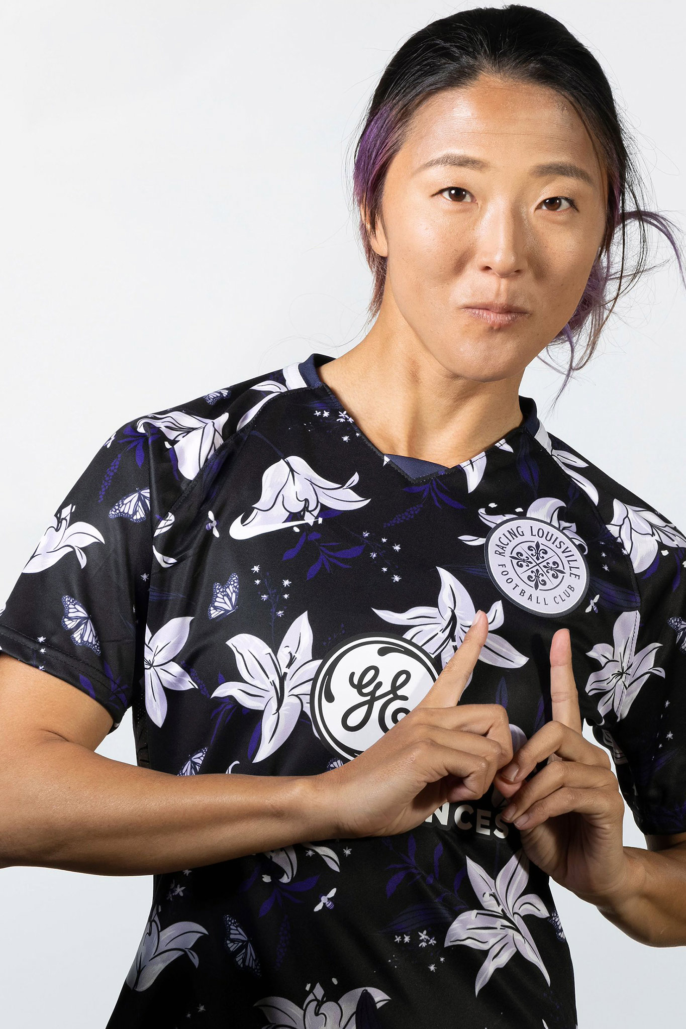
Louisvillians seem to view their city as a crossroads, both geographically and culturally. We represented this with intersecting lines at the heart of the crest. Each resulting quadrant contains a fleur-de-lis — or lily flower — a symbol that’s firmly embedded in Louisville’s heritage. The three-petaled emblem has for centuries been associated with French heraldry. In Louisville, it’s a symbol of identification and point of pride.
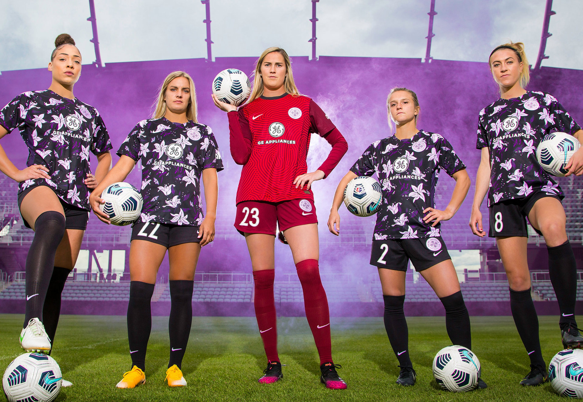
Lavender and deep violet are unique in the American soccer landscape, and can live in harmony alongside royal purple, the primary color of the organization's men’s team, Louisville City FC. We added mint green as an accent. Kentucky Derby fans will know why.
Meg Linehan of The Athletic wrote about the branding process here. The club unveiled the brand identity ahead of their inaugural season in 2021.
DELIVERABLES
- Club name
- Primary crest
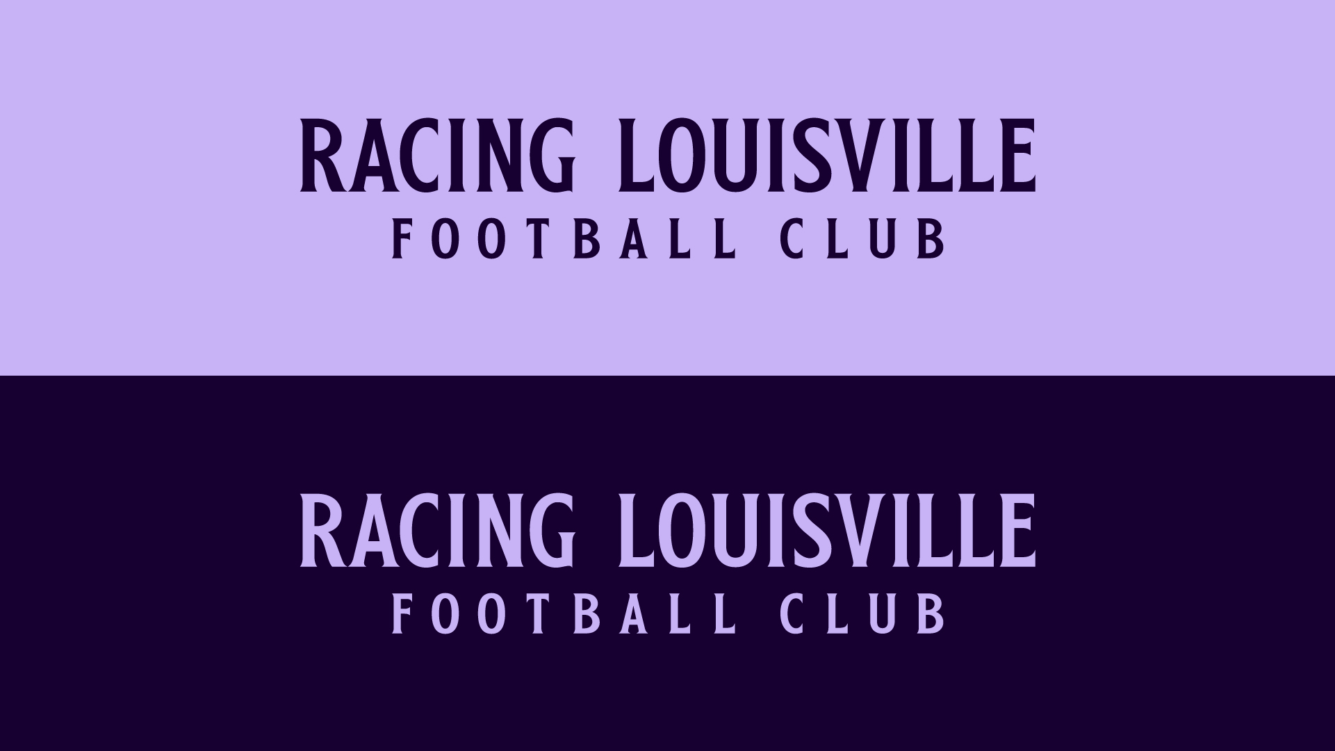
- Wordmarks
- Secondary marks
- Color scheme
- Name & number font
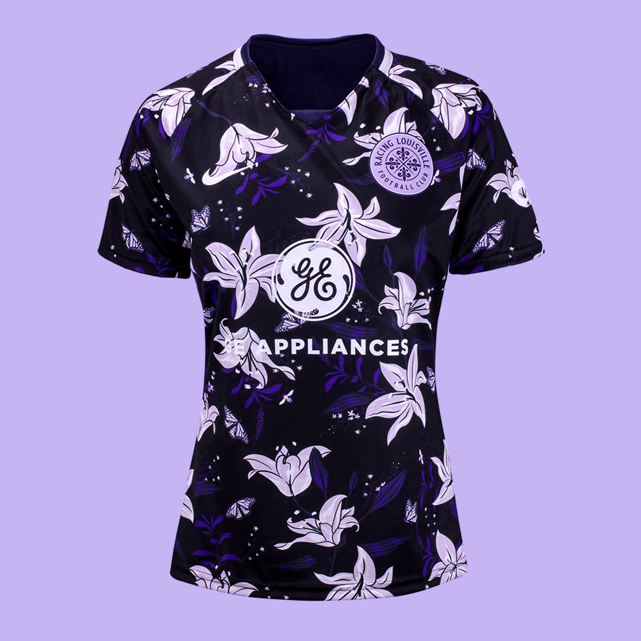
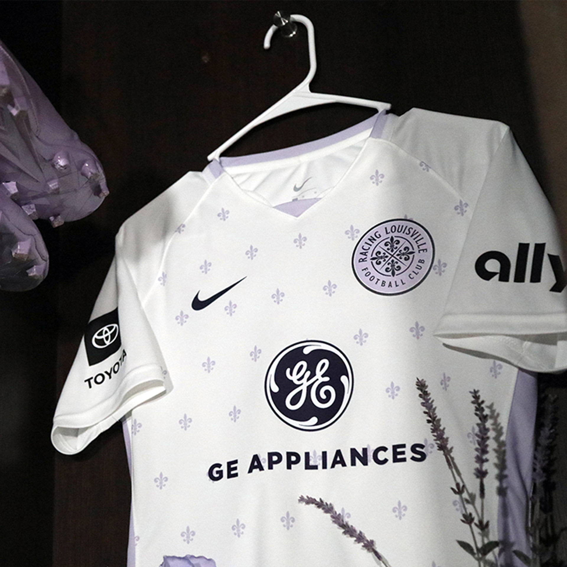
- 2021 Home kit
- 2021 Away kit
LAUNCH DATE
July 2020
MORE WORK