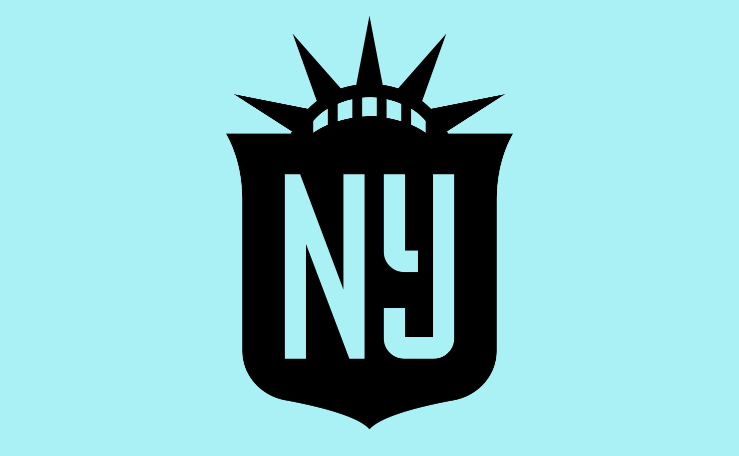


Charleston Battery
Brand refresh for the Charleston Battery, a USL Championship soccer club in Charleston, South Carolina.
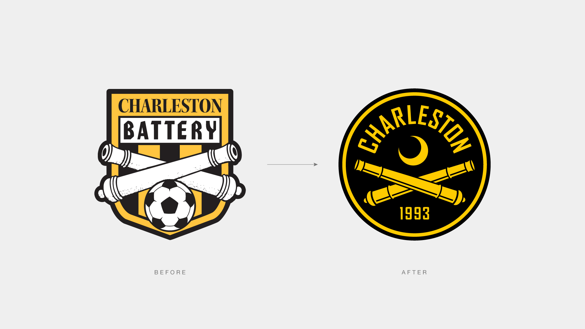
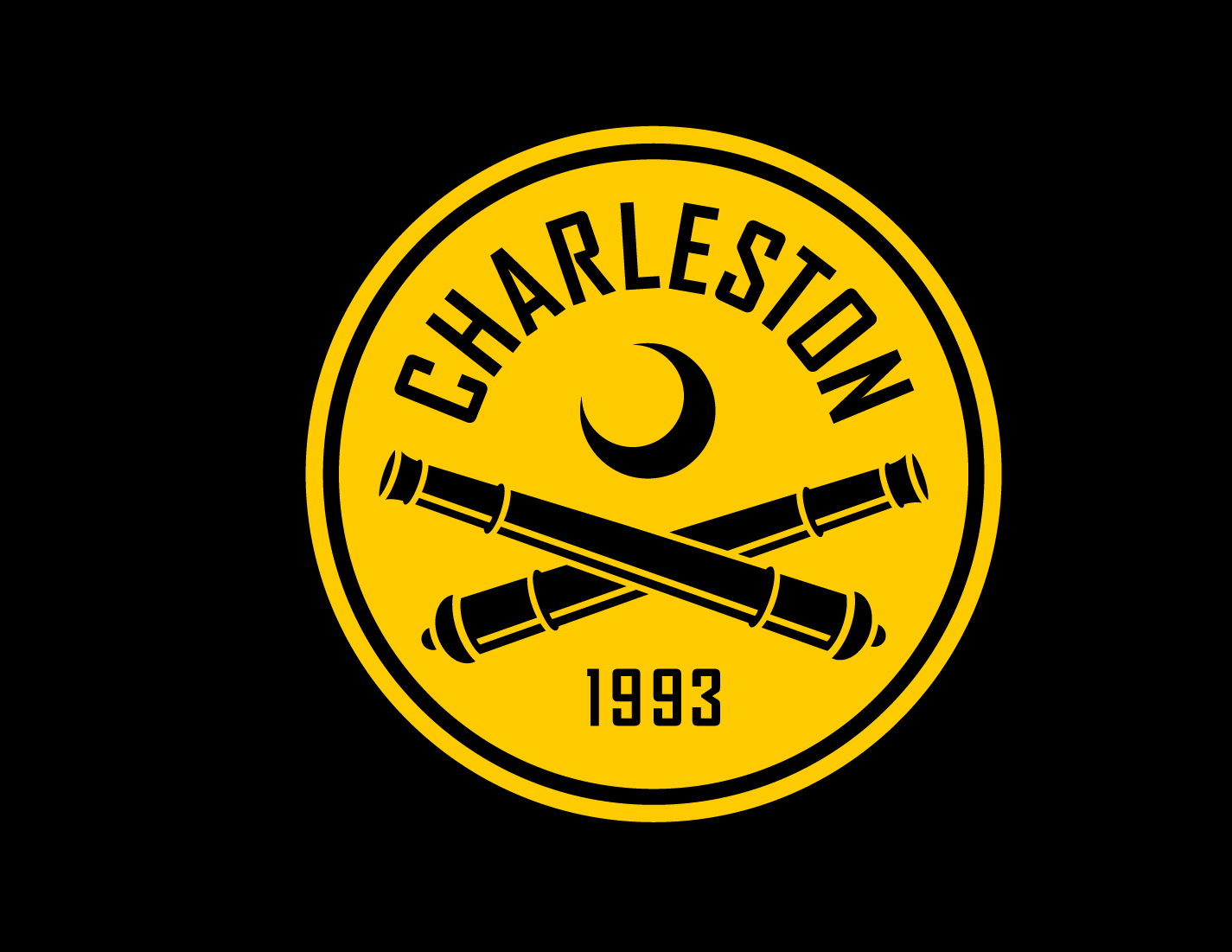
Despite being the oldest continuously operating pro club in the country, until this redesign The Battery had never made edits or updates to their visual identity. The original crest had a sort of kitschy charm. It harkened back to a different era of soccer in this country, but ultimately it was outdated and did not reflect the ambitions of the club today.
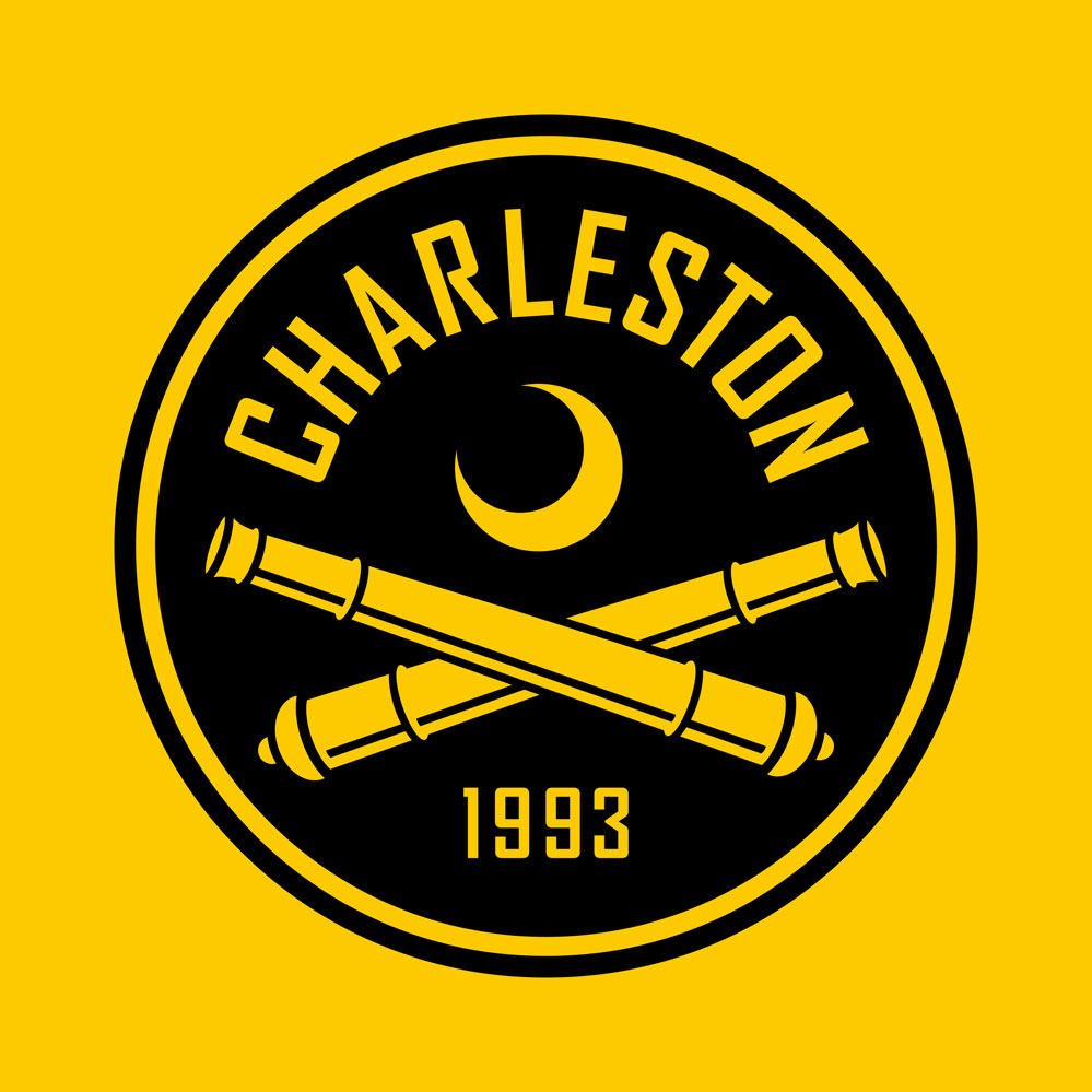
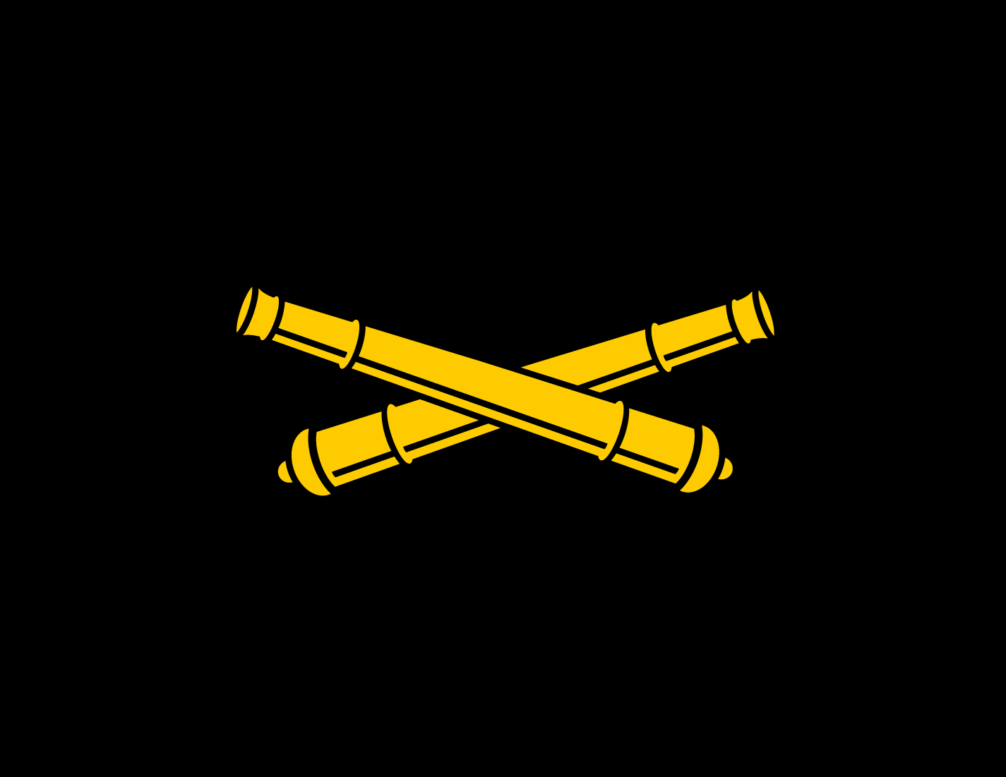
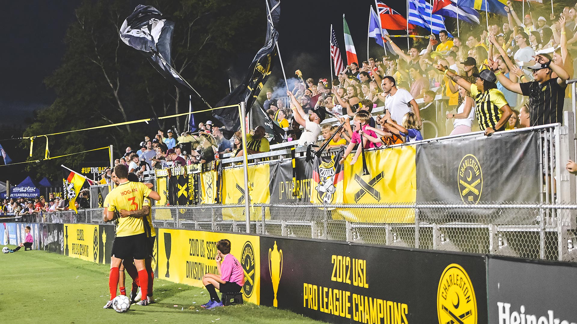
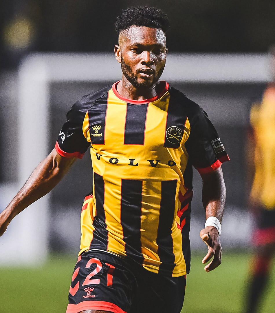
The Charleston Battery are one of very few clubs in the country with a strong and distinct visual identity. The black and yellow stripes are iconic in American lower division soccer. Very early in the design process we realized it would be a mistake to drastically shift the color scheme.
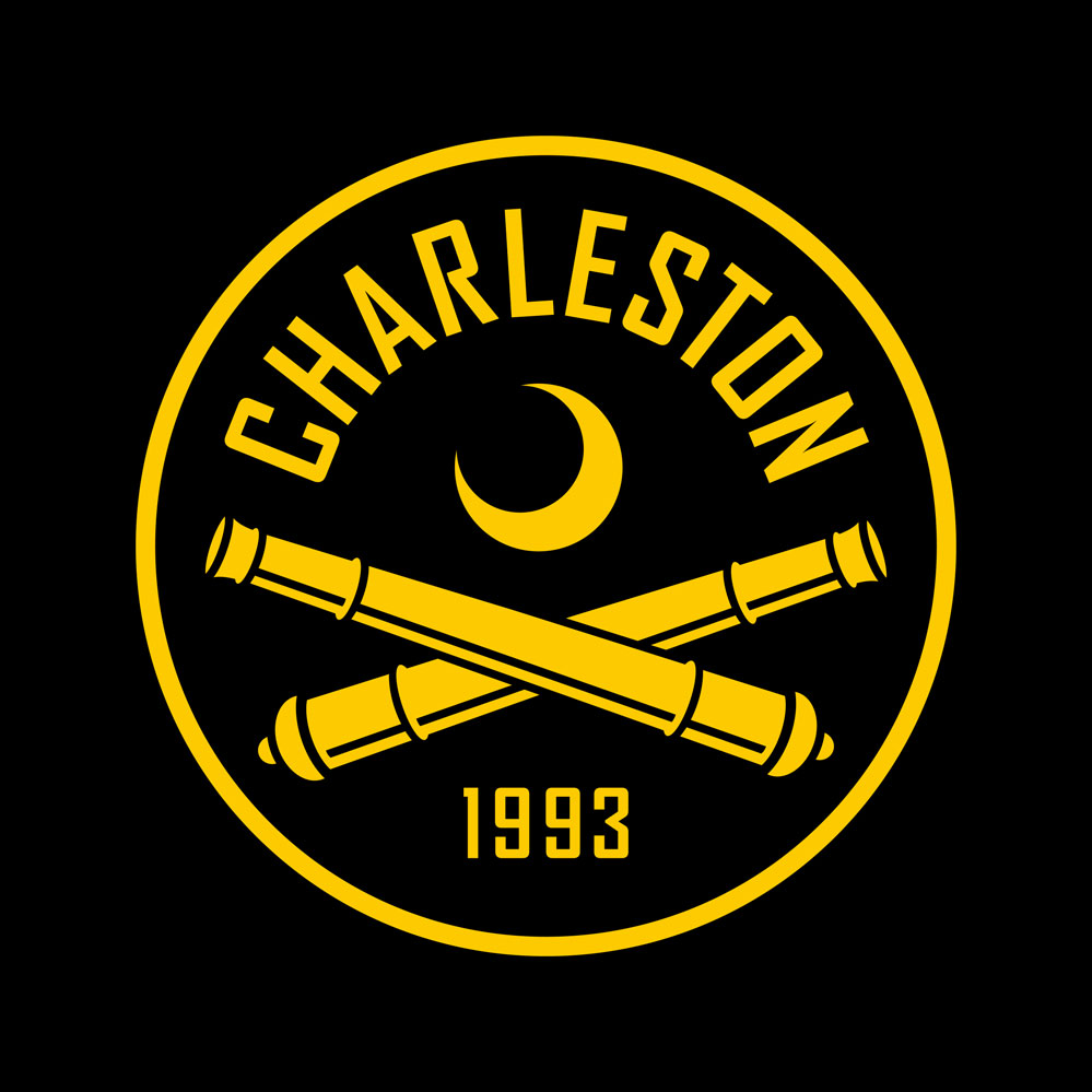
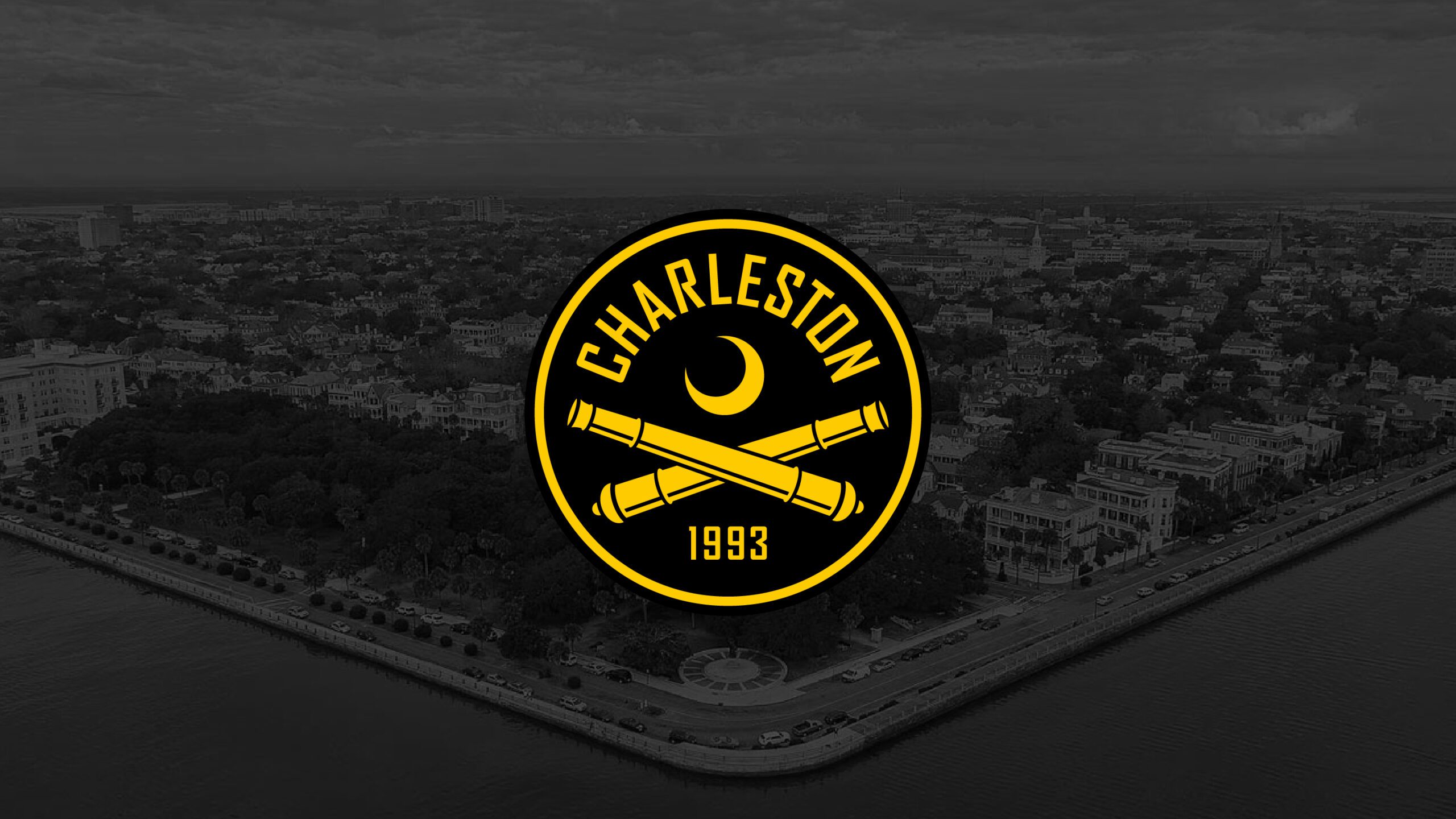
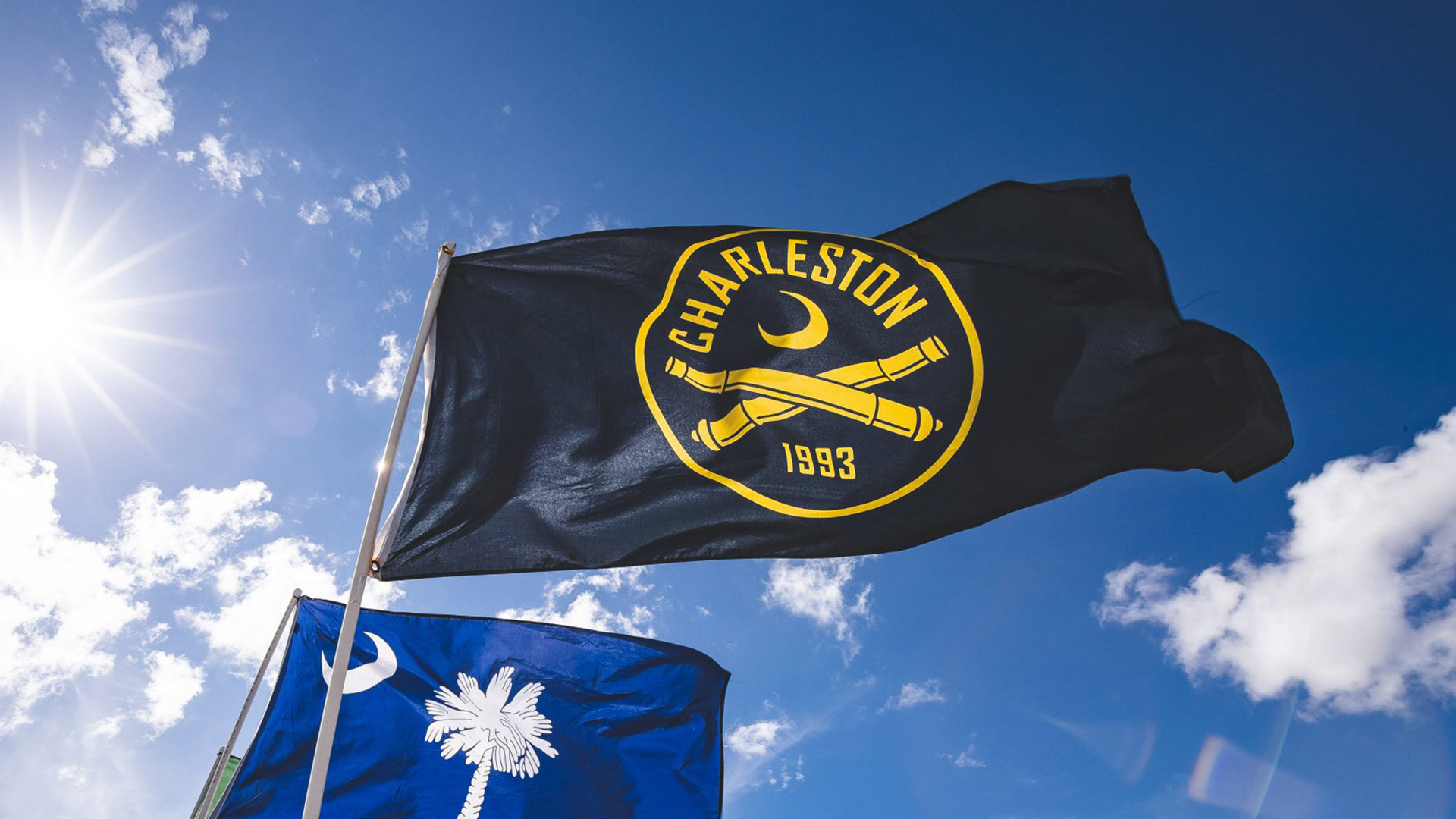
We were also cognizant that supporters may have a strong emotional connection to the original crest, and for that reason, we kept many of the design elements intact. The emphasis of the crest is now on “Charleston” rather than “Battery.” We believe this will help reach a broader audience and translate better to merchandise. The “1993” was added to show off the club’s history.
DELIVERABLES
- Primary crest
- Secondary marks
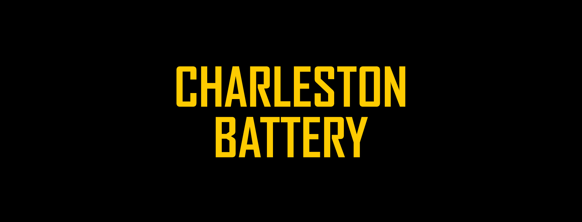
- Wordmarks
- Color scheme
- Kit strategy/creative direction
LAUNCH DATE
December 2019
MORE WORK