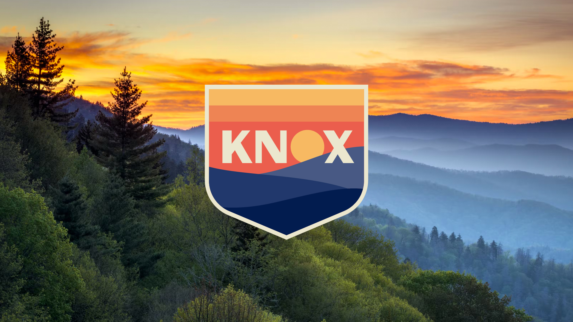


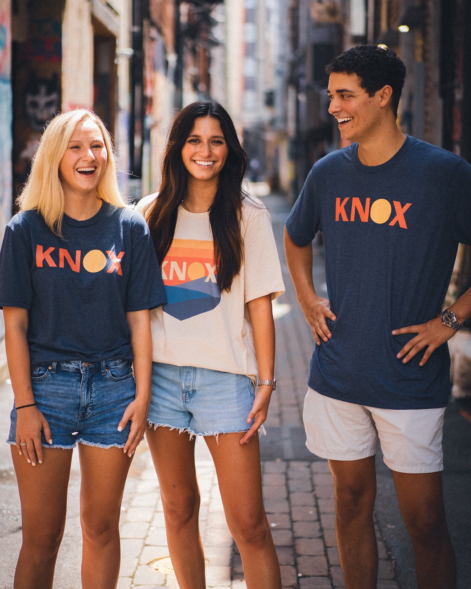
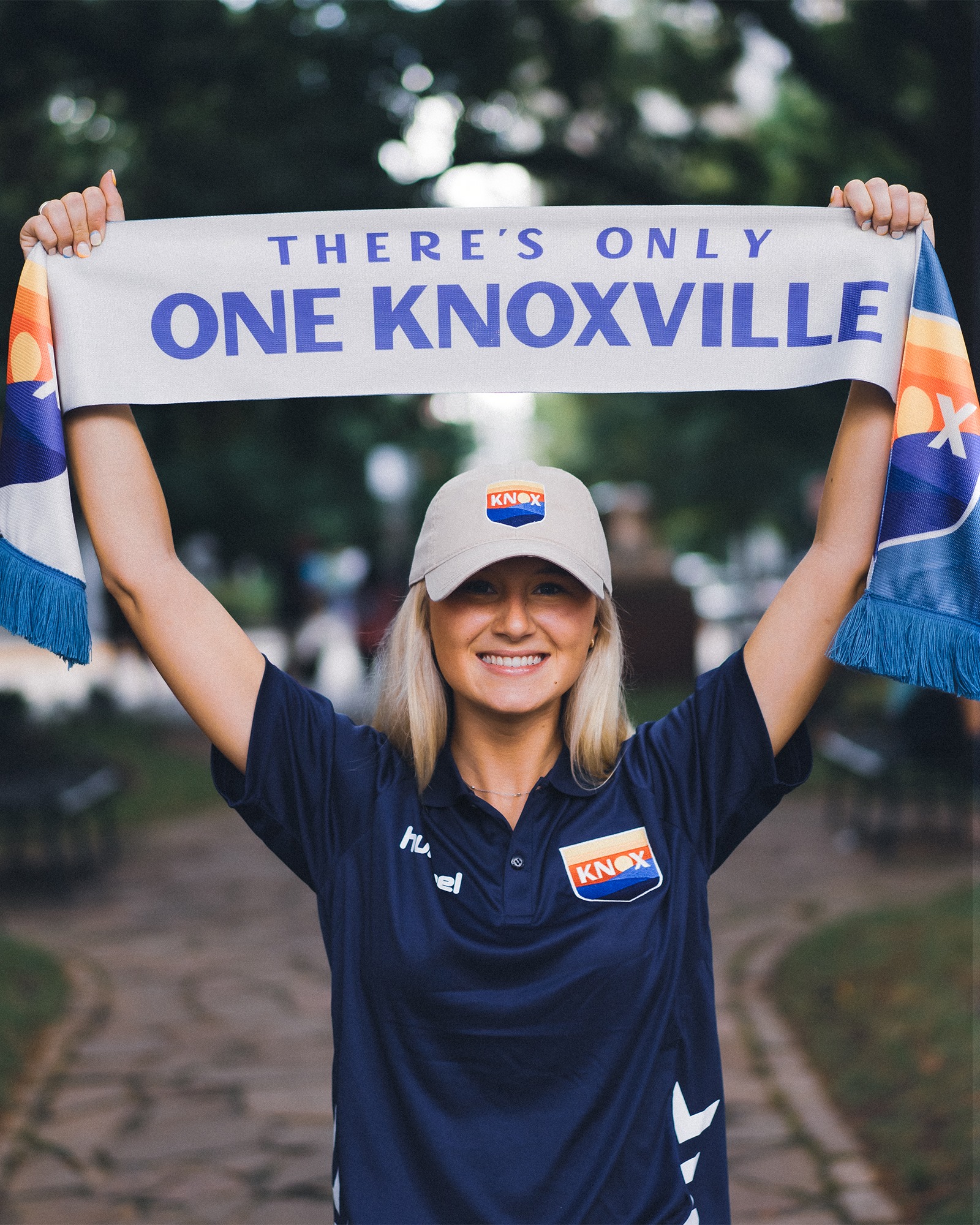


One Knoxville SC
Full brand identity for One Knoxville Sporting Club, an expansion USL soccer club in Knoxville, Tennessee.
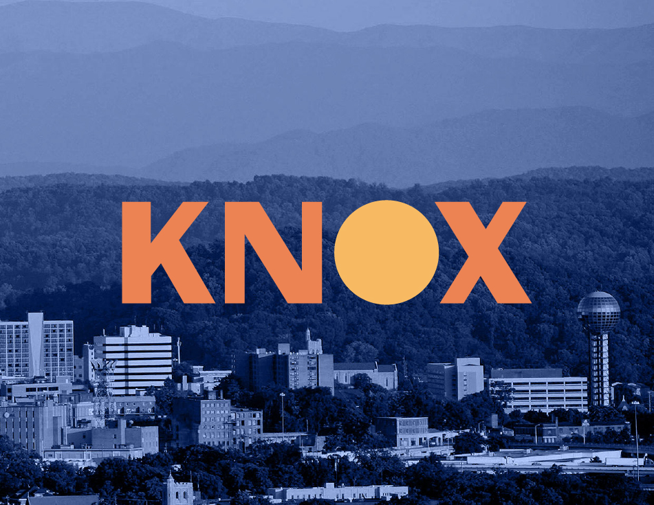
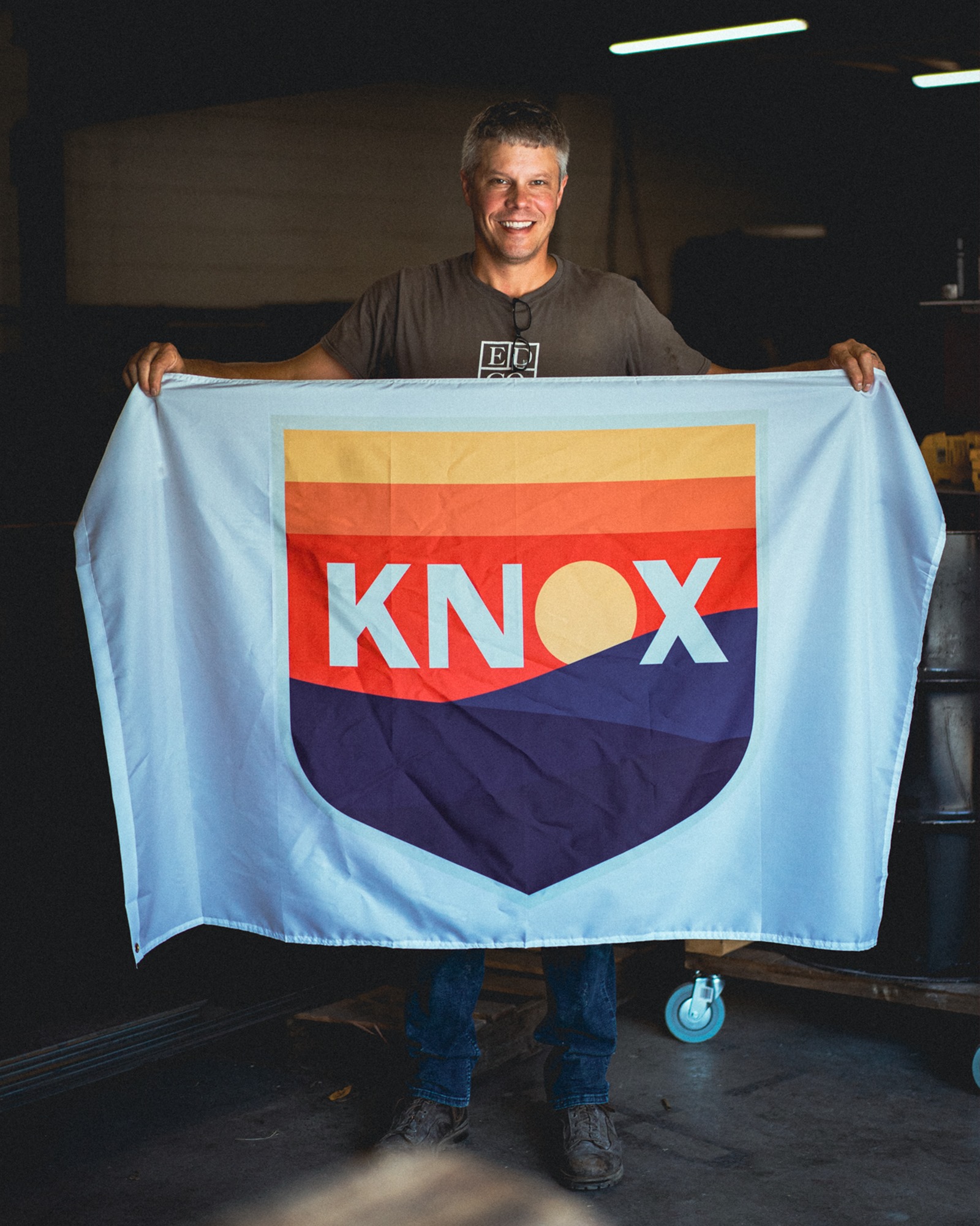
Knoxville is welcoming and unpretentious. It’s a growing metropolis, but maintains small town values. Tucked into the Great Smoky Mountains, Knoxville is proud of its ‘urban wilderness’ — a vibe I hoped to capture in the branding.
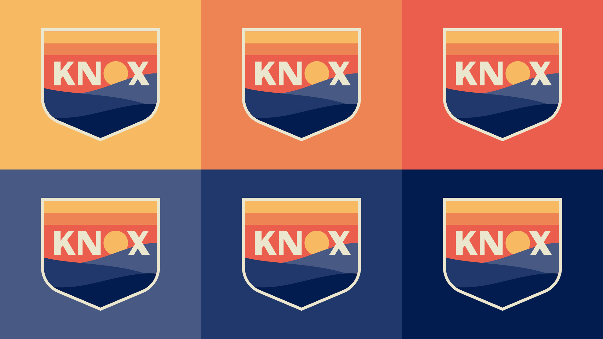
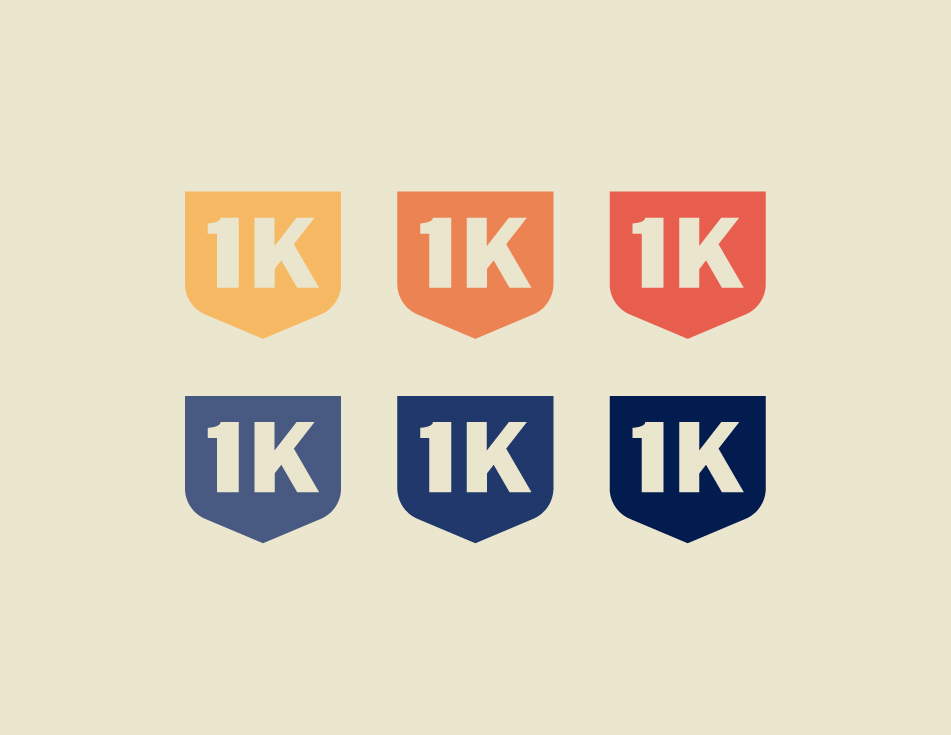
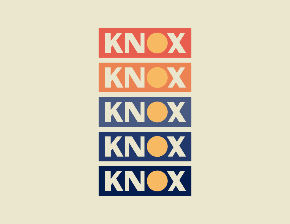
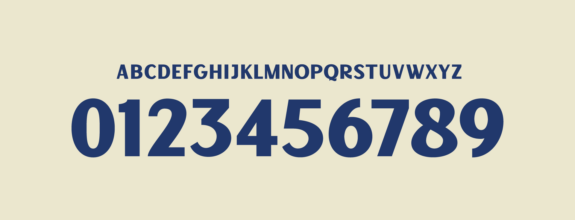
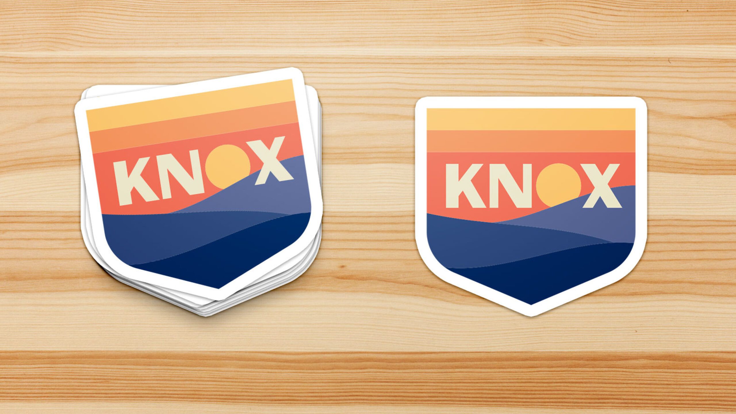
The robust color scheme — equal parts warms and cools — is drawn from a sunrise over the mountains. The typography is inspired by the Great Smoky Mountains WPA posters from the 1930s and 1940s.
The visual identity — intended to represent not just a new soccer club, but the entire city — was unveiled in August 2021, ahead of the clubs inaugural season. Read more about the process here.
DELIVERABLES
- Primary crest
- Secondary marks
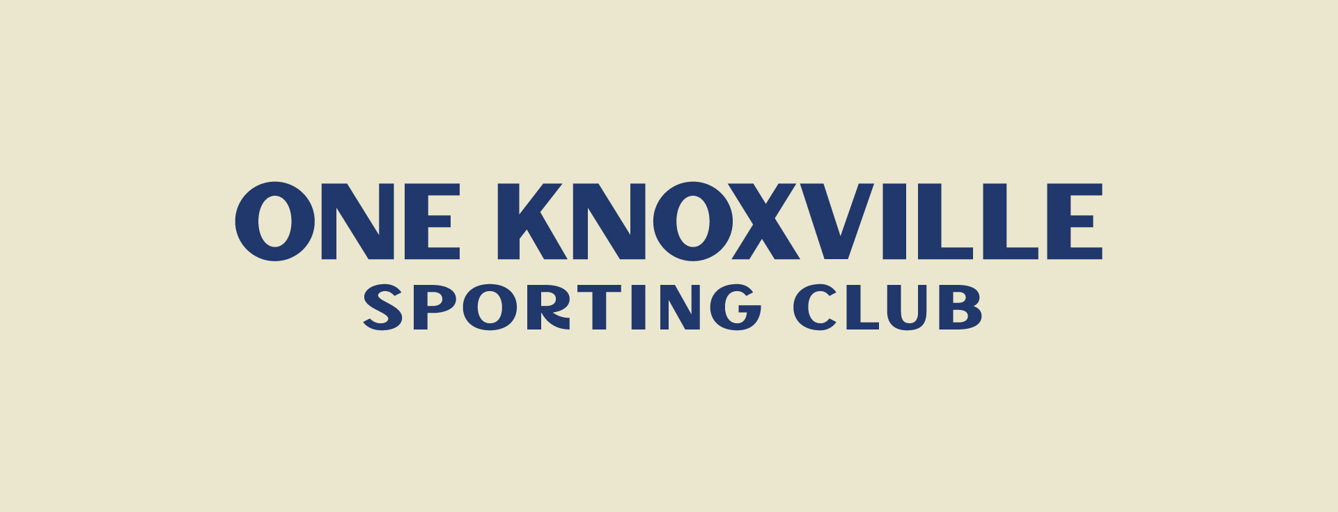
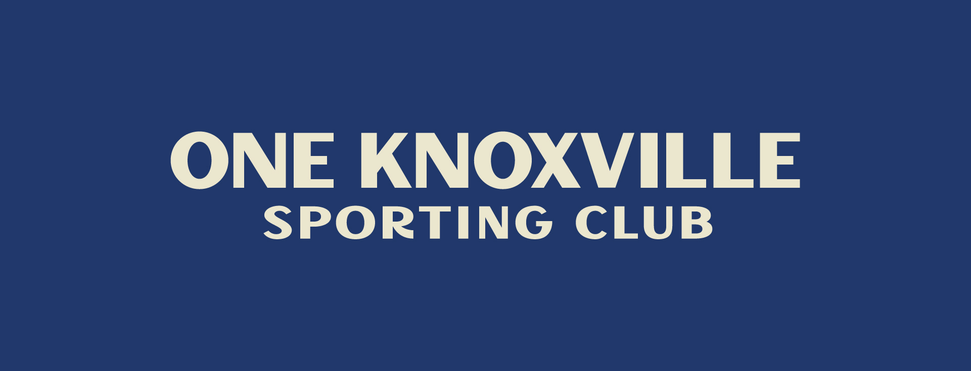
- Wordmarks
- Color scheme
- Name & number font
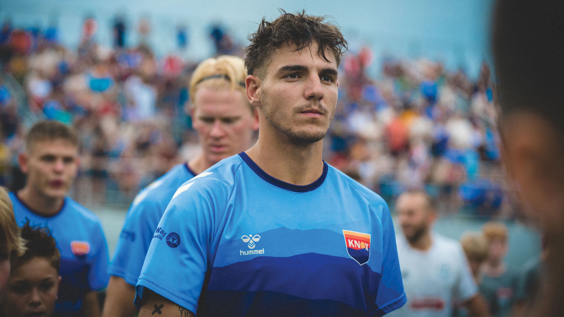
- 2022 Home kit
- 2022 Away kit
LAUNCH DATE
August 2021
MORE WORK