

Union Omaha
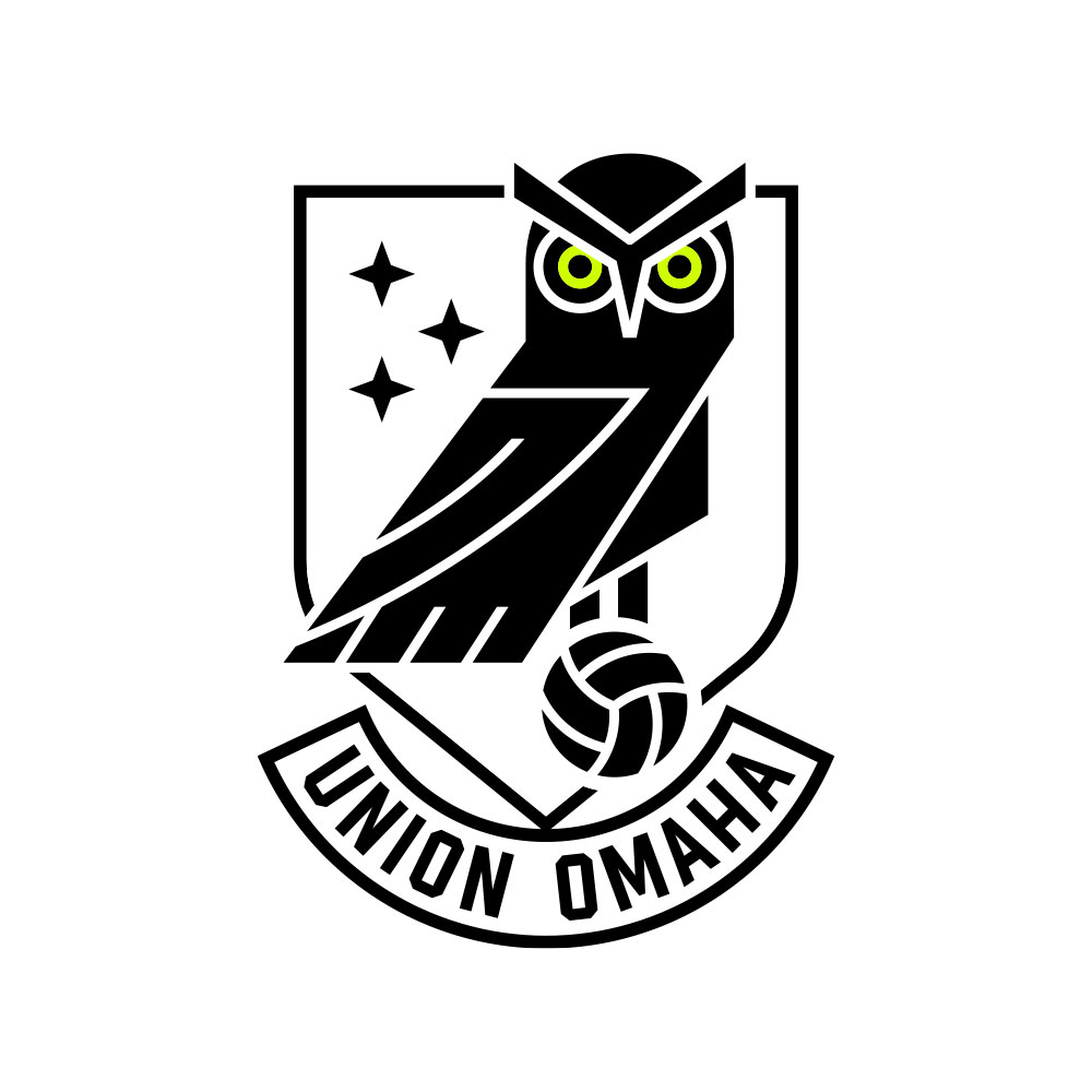
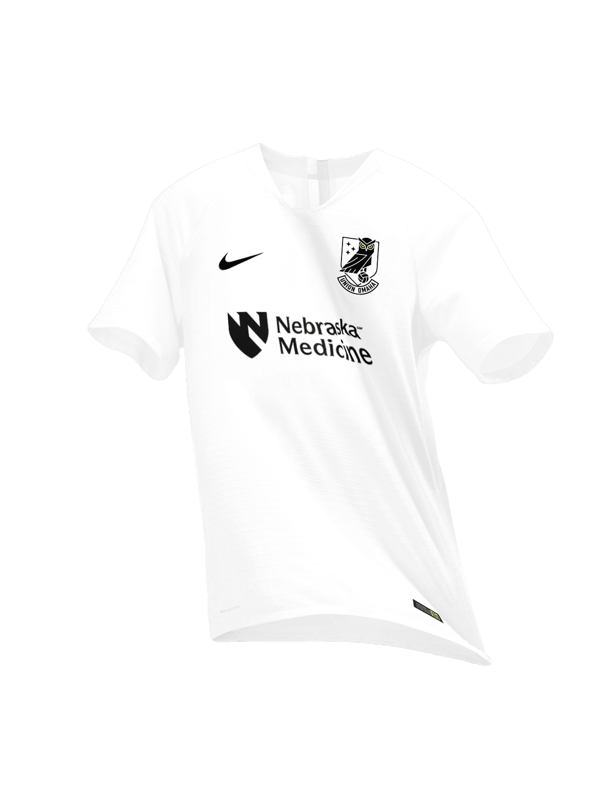
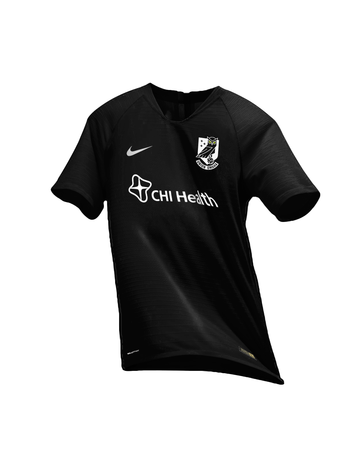
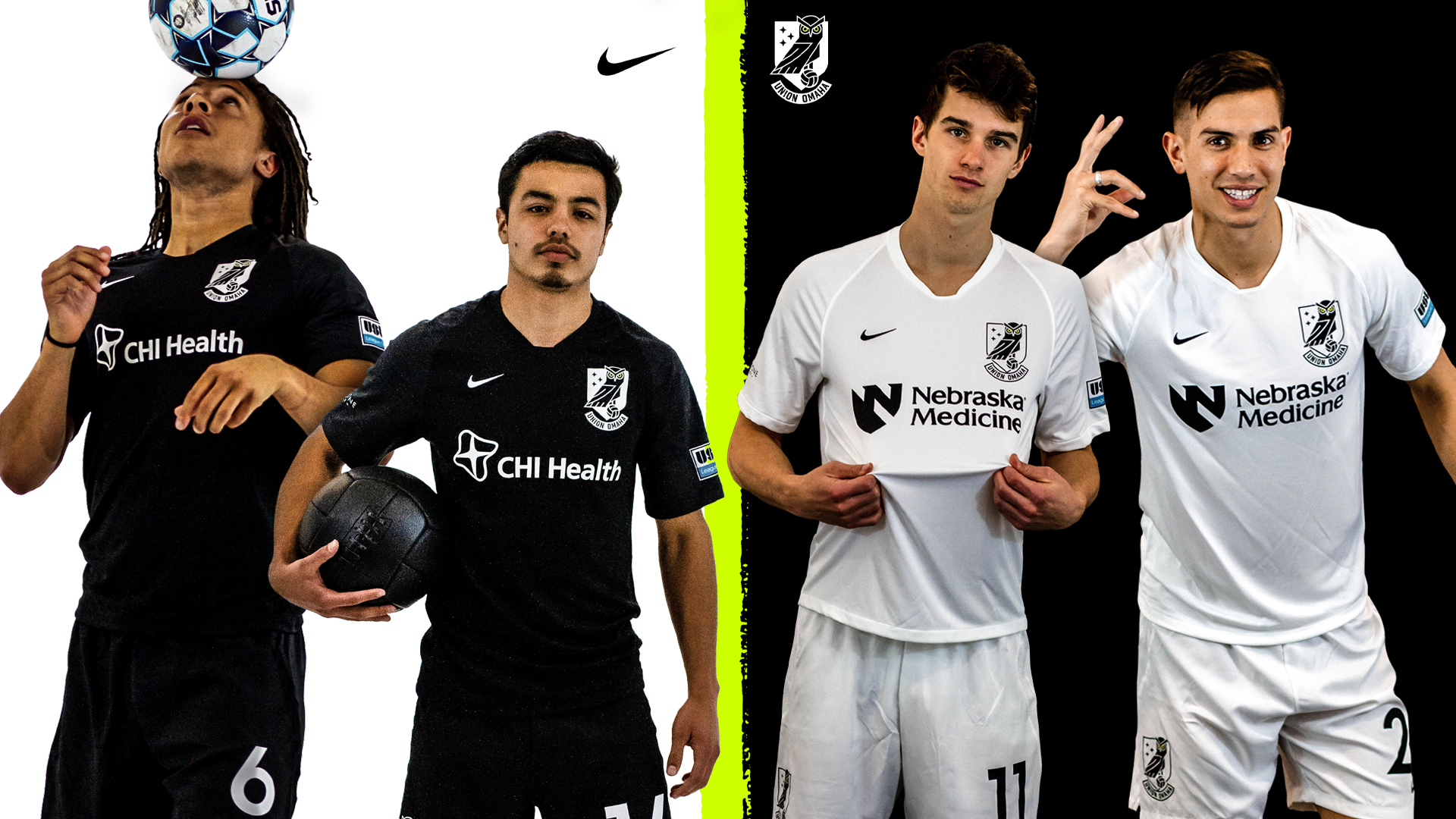
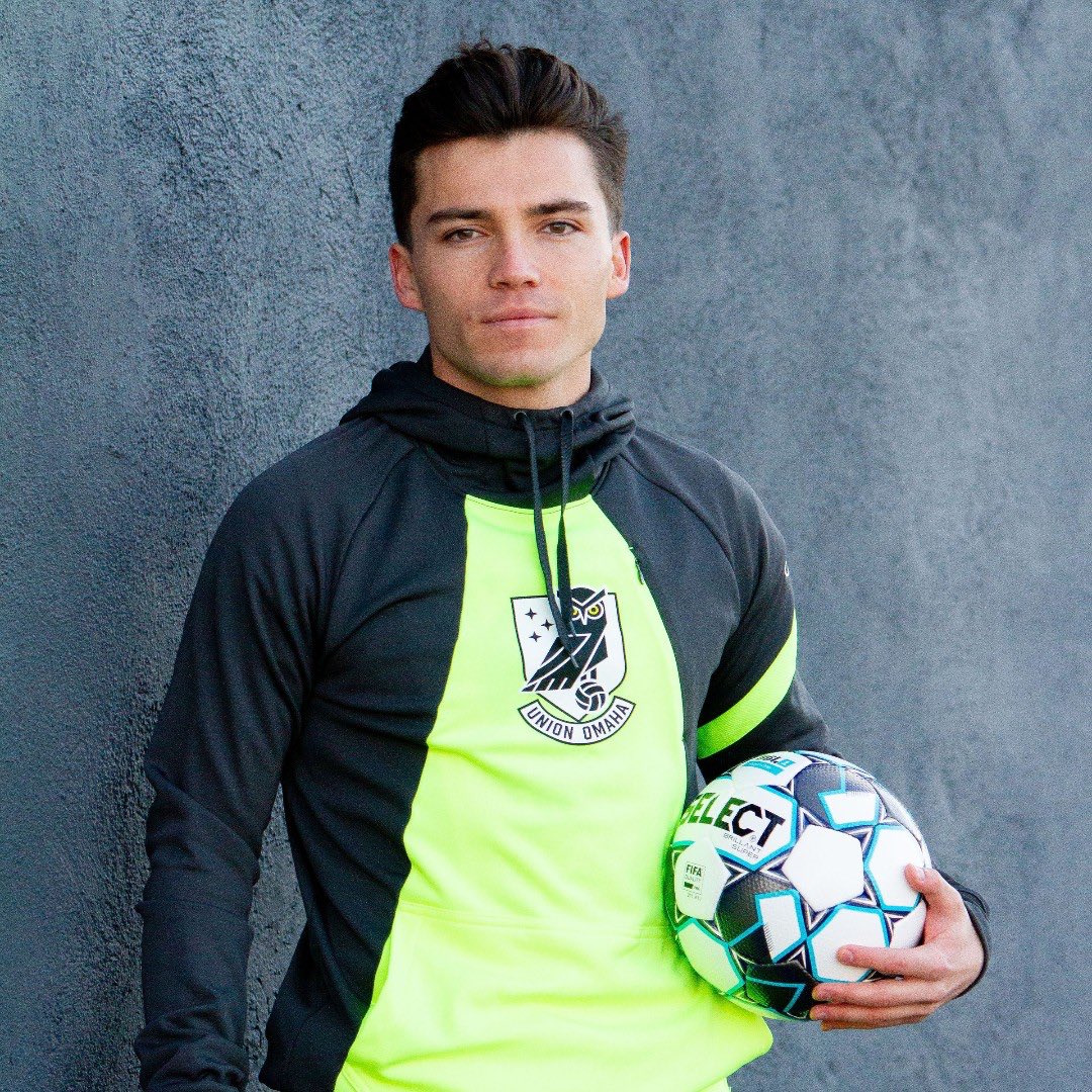
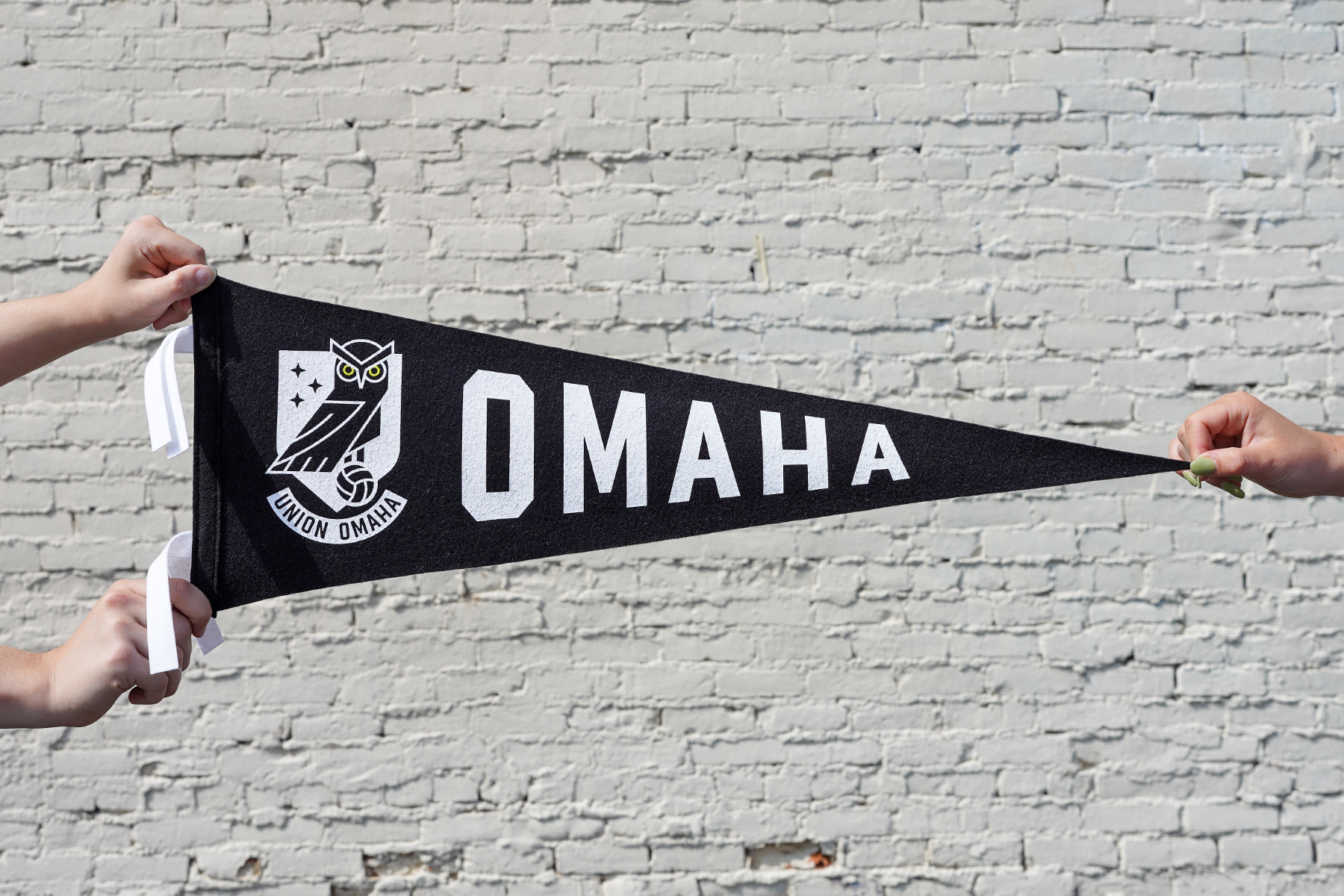
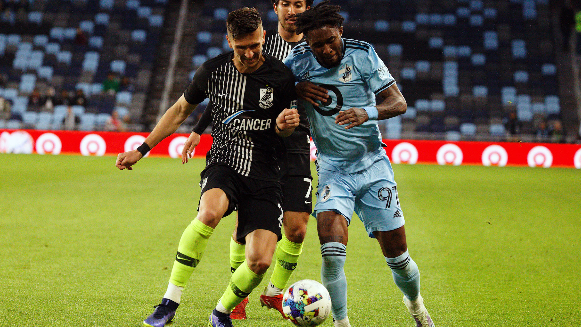
Full brand identity design for Union Omaha, a minor league soccer club based in Omaha, Nebraska.
Club ownership came to me in the summer of 2019 with a totally blank canvas. My instruction: create the identity for a new soccer team in Omaha.
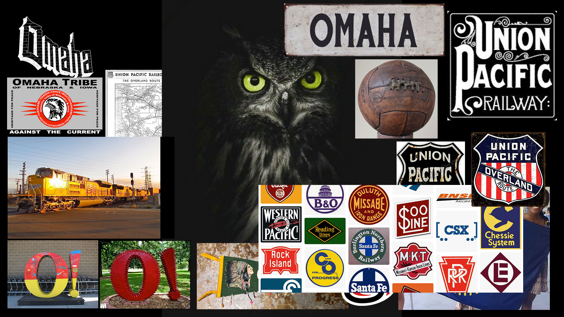
I proposed a club name with a direct tie to local industry and history. Locals will understand the railway reference, while out-of-towners may see it as a nod to the blue collar workers that have long-served as the city’s heartbeat.
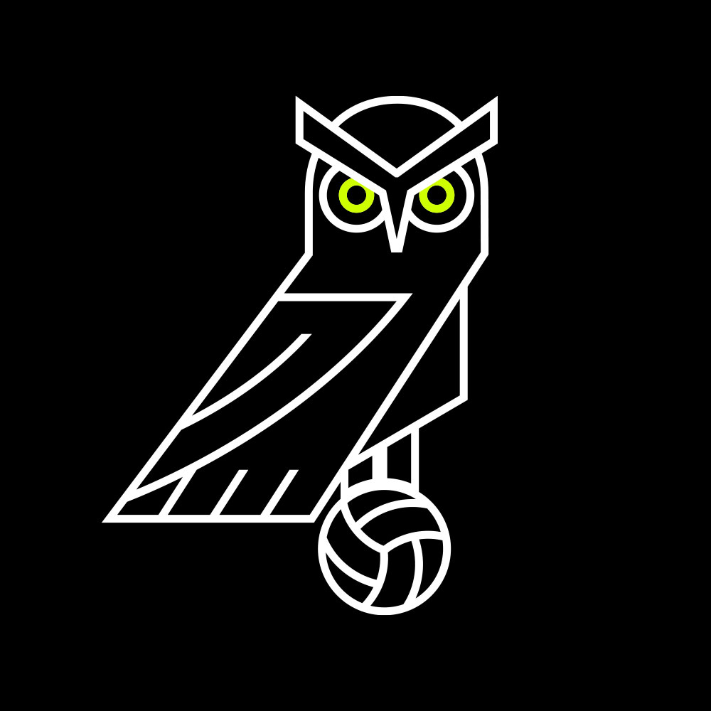
The crest is built around a Great Horned Owl, an elegant, perceptive, and fiercely competitive predator. Native to Omaha, they are symbols of wisdom, intuition, cunning and stealth. Their grip can exert forces greater than 25 pounds of pressure. Their distinctive yellow eyes set them apart from other owl species.
I chatted with Jeff Rueter of The Athletic about the branding process. You can read his piece here.
DELIVERABLES
- Primary crest
- Secondary marks
- Color scheme
- Wordmarks
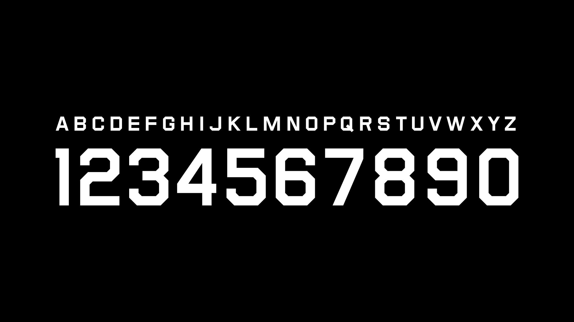
- Name & number font
- Kit strategy / creative direction
LAUNCH DATE
October 2019
MORE WORK


