
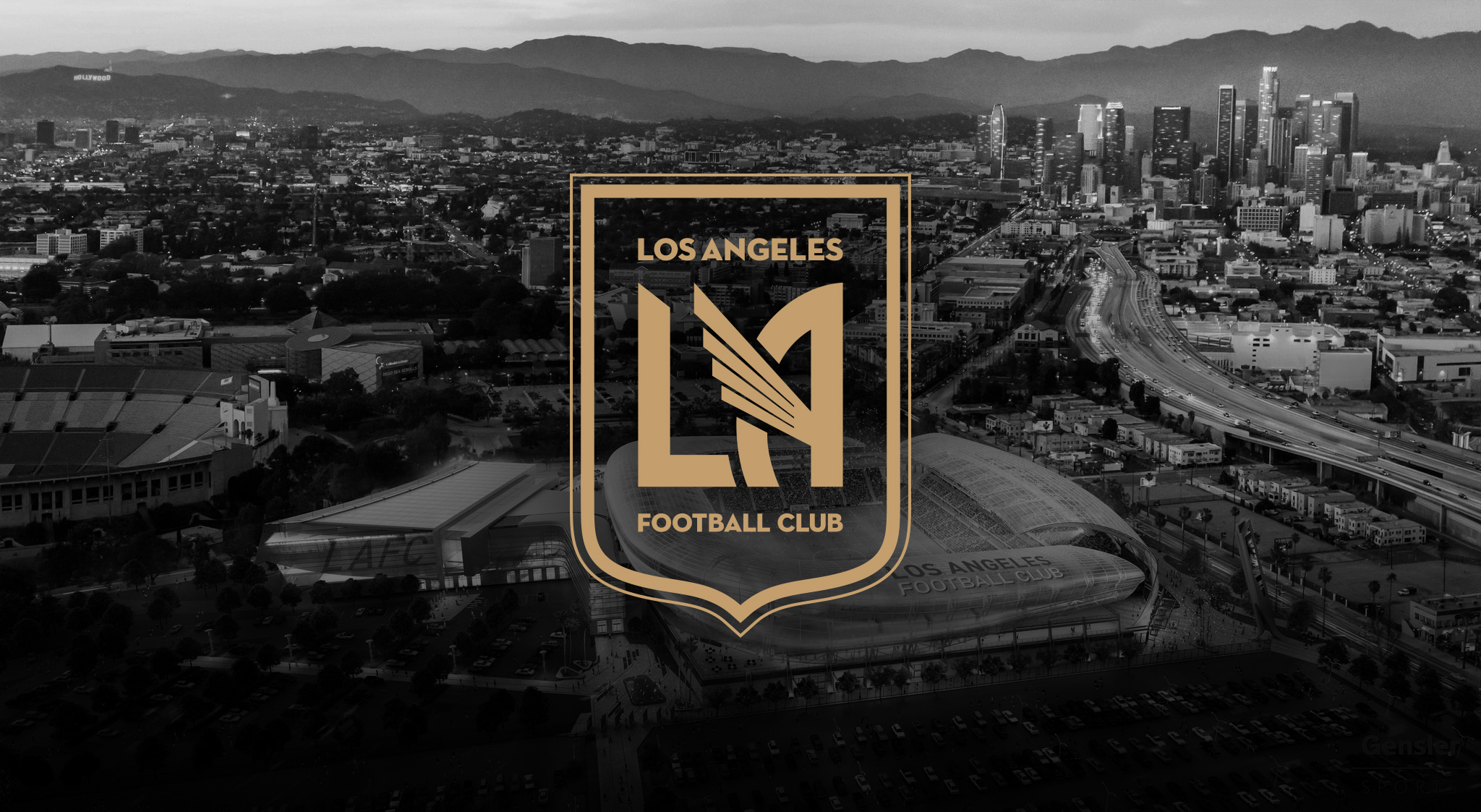
Los Angeles Football Club
Full brand identity for Los Angeles Football Club (LAFC), an expansion Major League Soccer club.
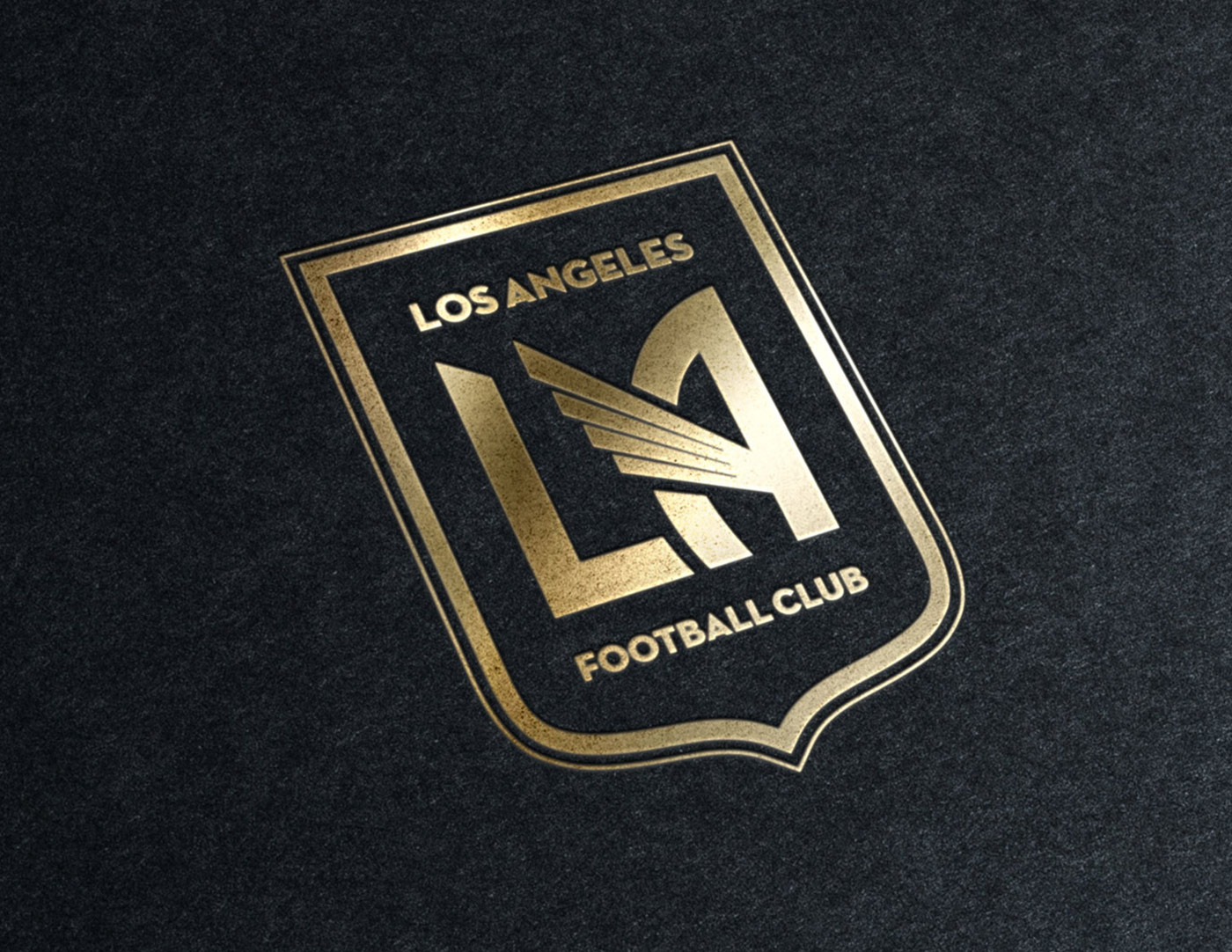
Backed by a star-studded ownership group that includes Magic Johnson, Will Ferrell, and Mia Hamm, LAFC promises to be a major force in the global game. Working for an agency called 'Spark', I was tasked to design the crest and visual identity for the club.
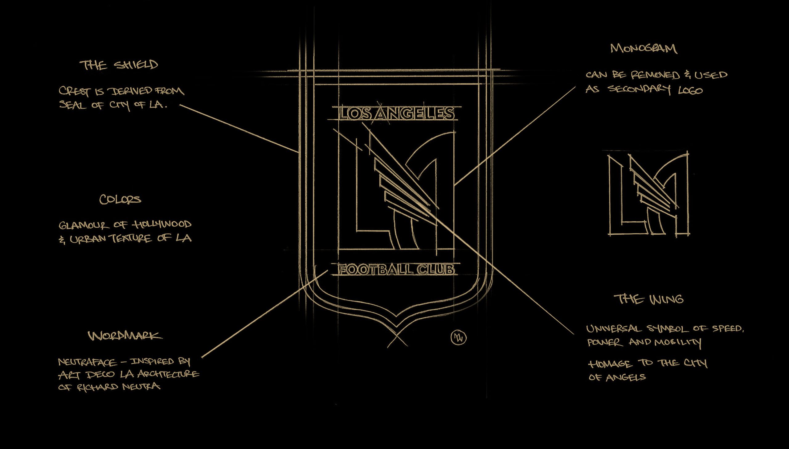
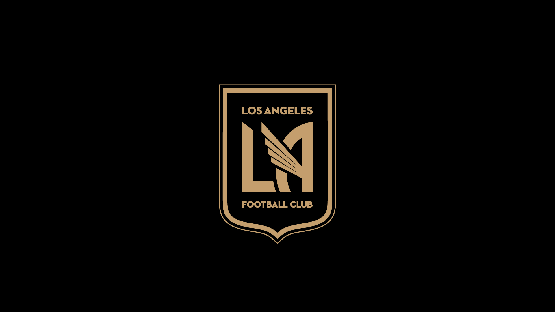
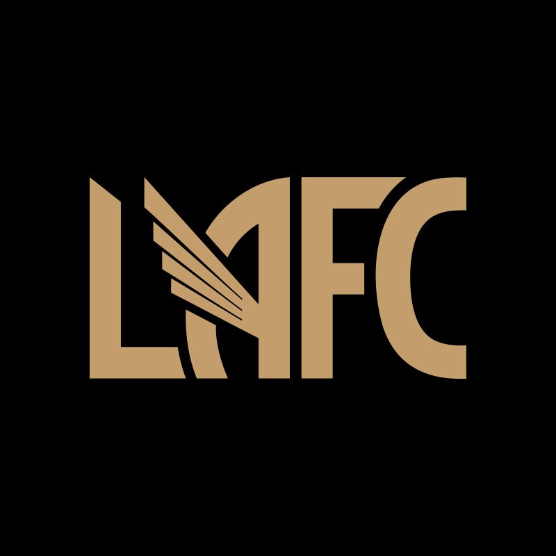
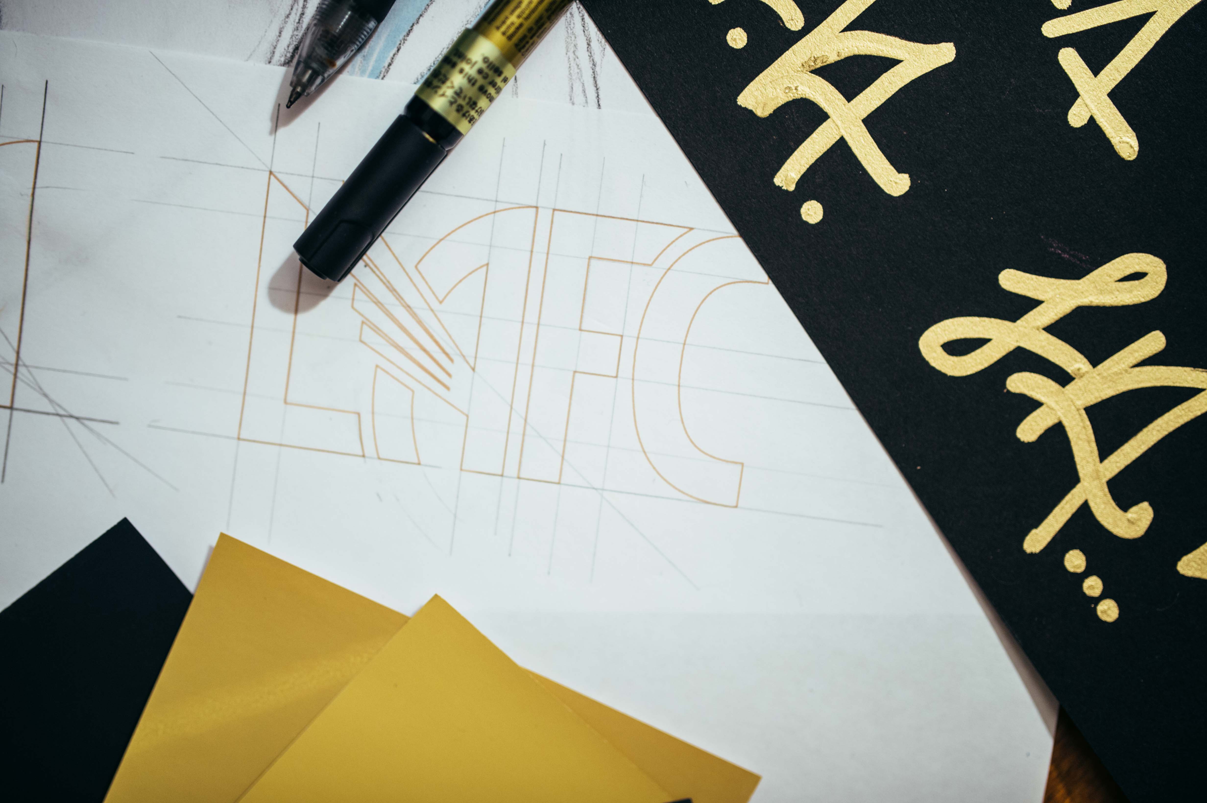
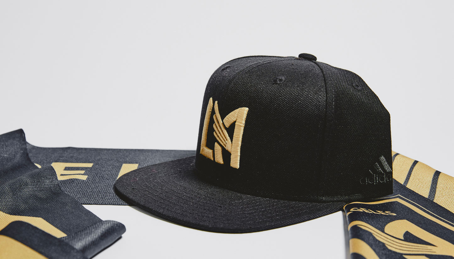
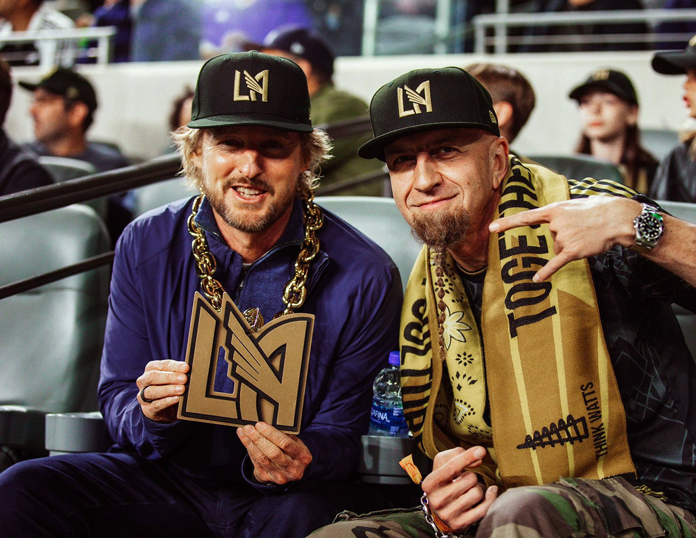
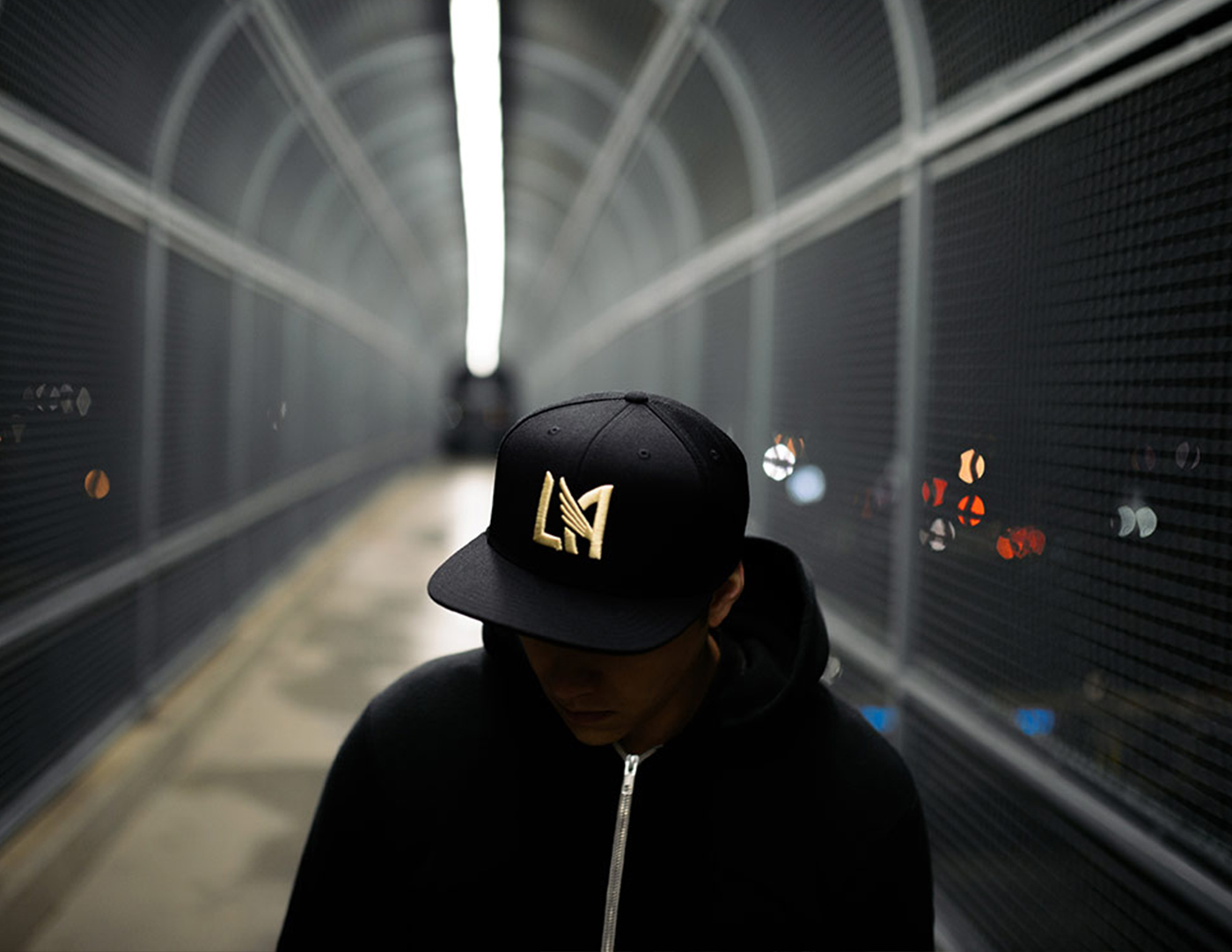
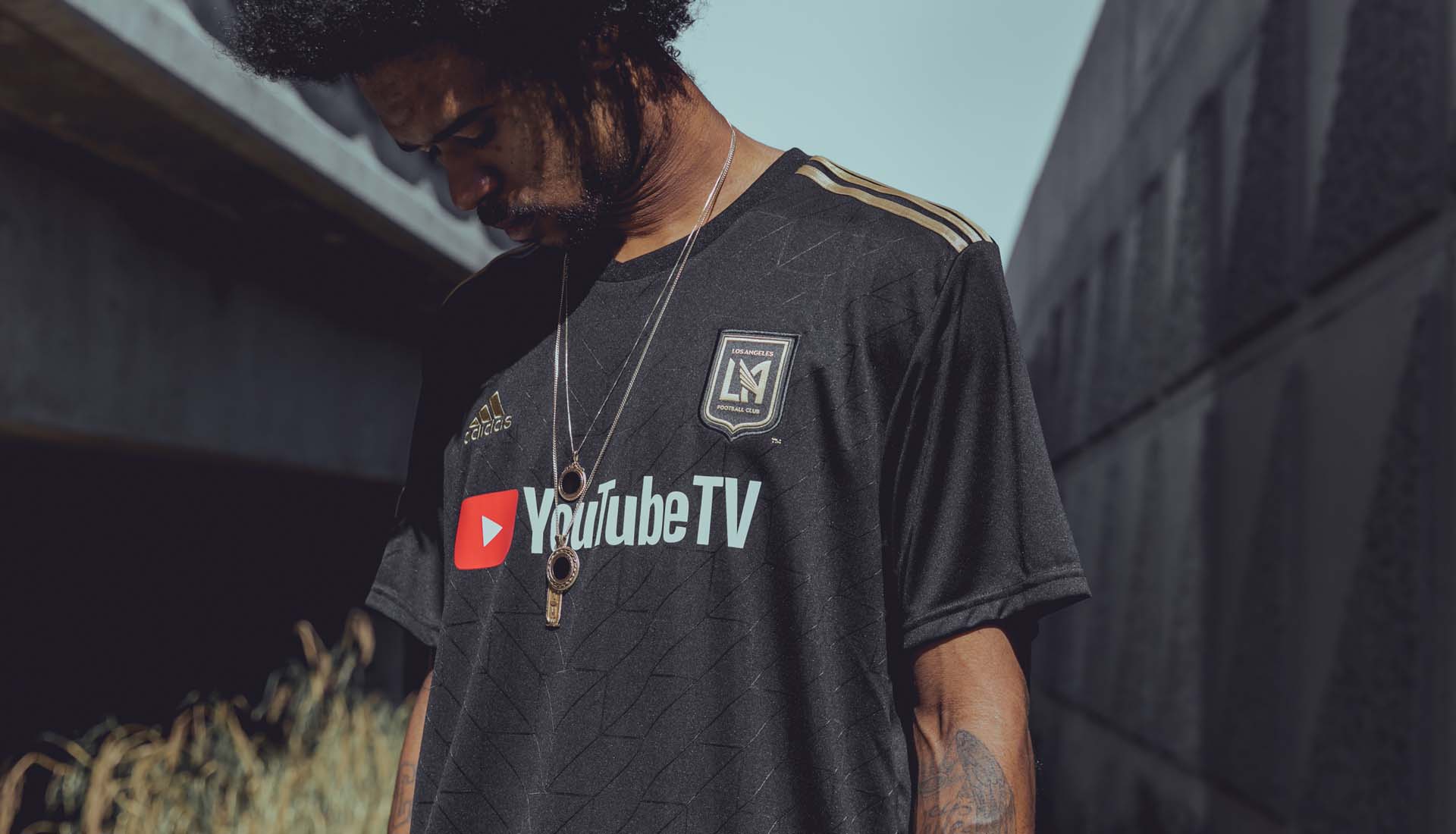
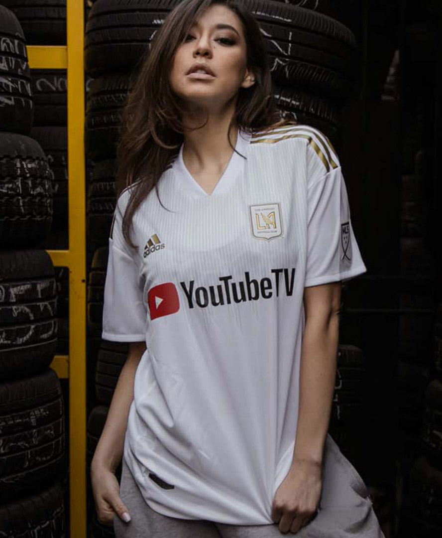
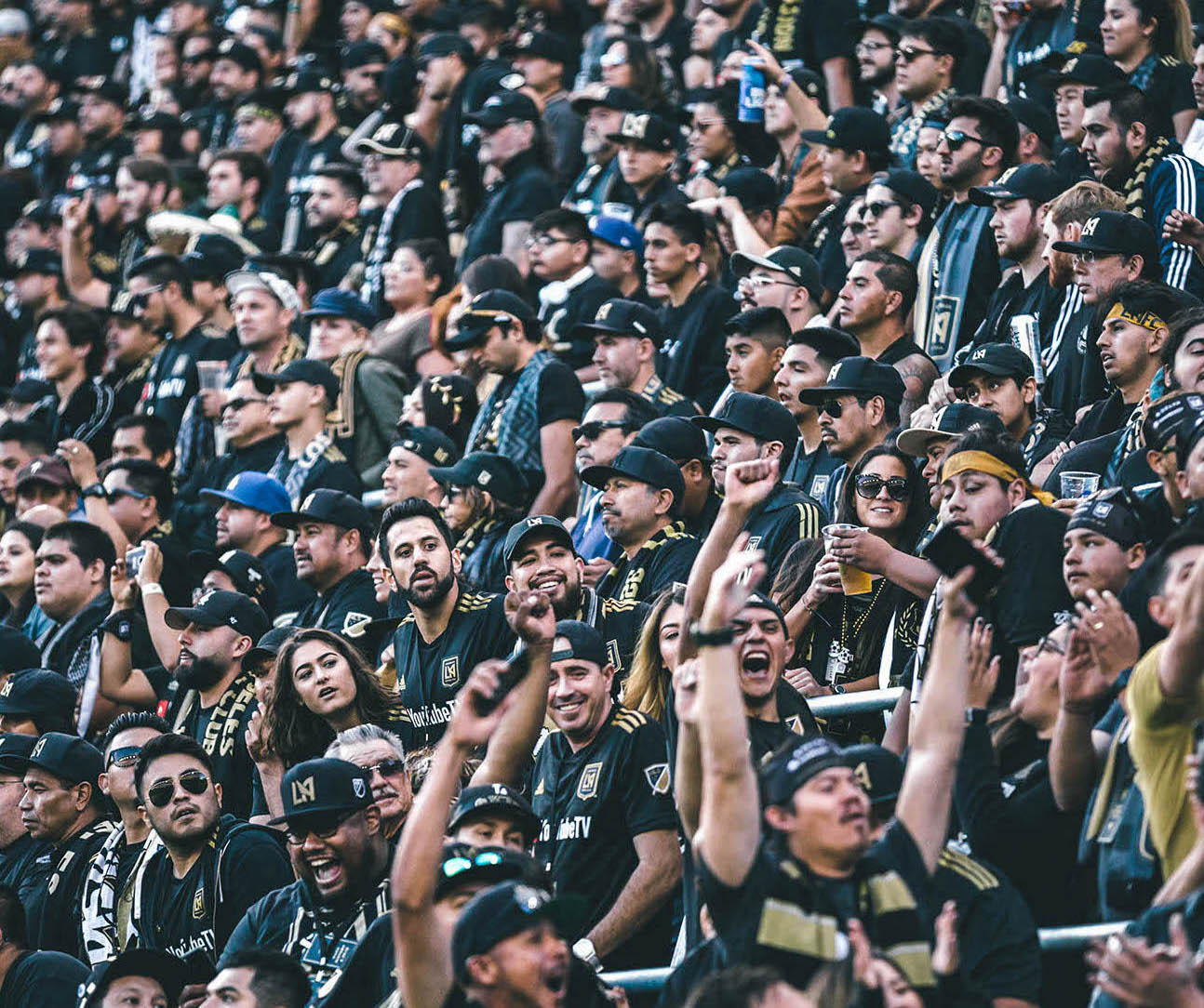
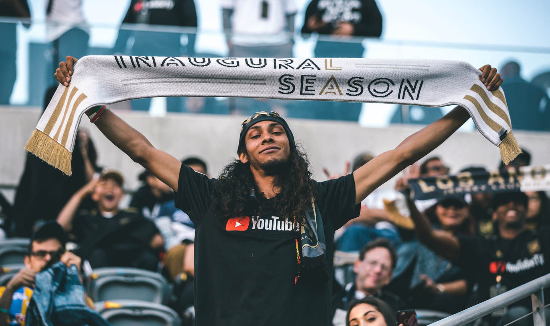
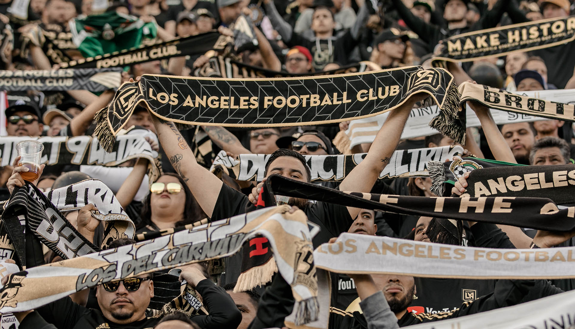
The goal was to create a mark that the people of Los Angeles would wear with pride. A look that they would identify with and rally behind. Early in the process we determined the heart of the visual identity would be the letters 'LA'. It was my job to craft these letterforms and make them unique, authentic, versatile, and timeless. Merchandising potential was a top priotiy — particularly the cap.
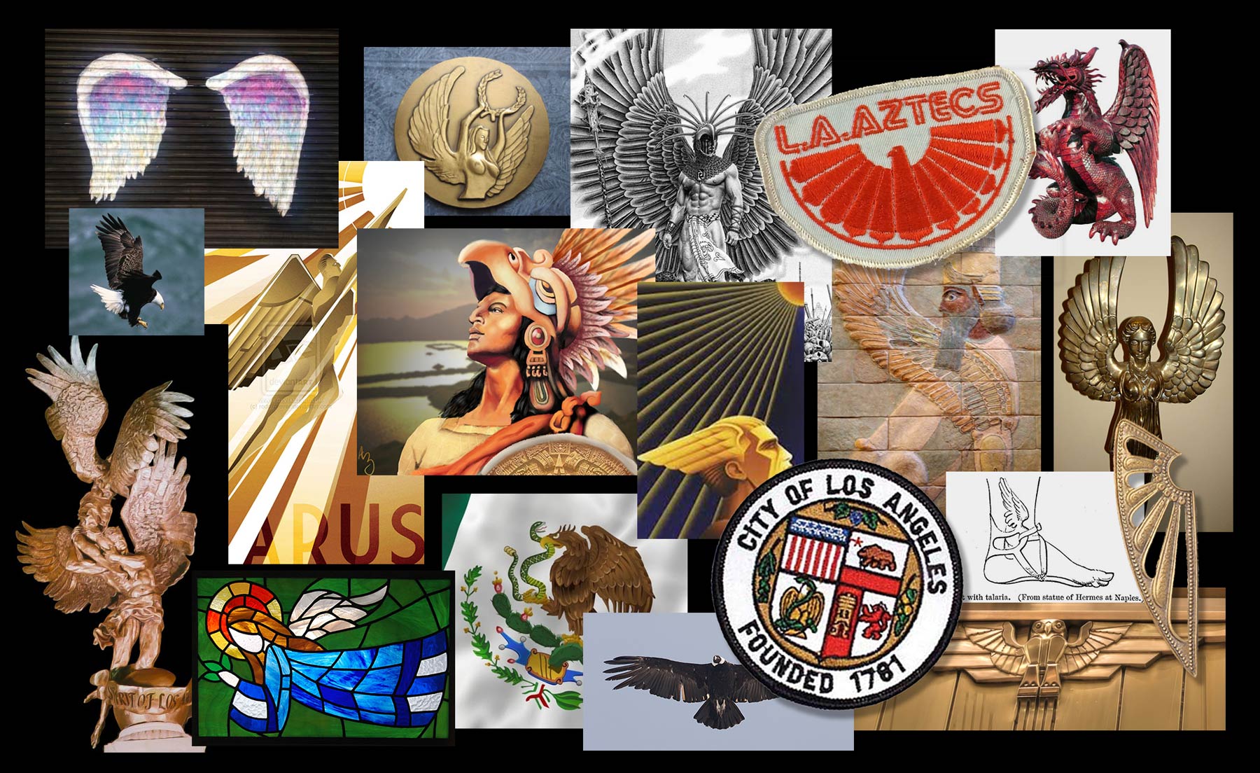
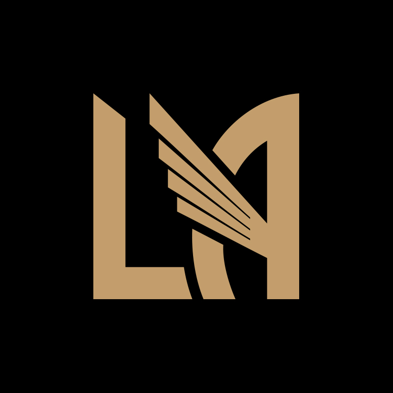
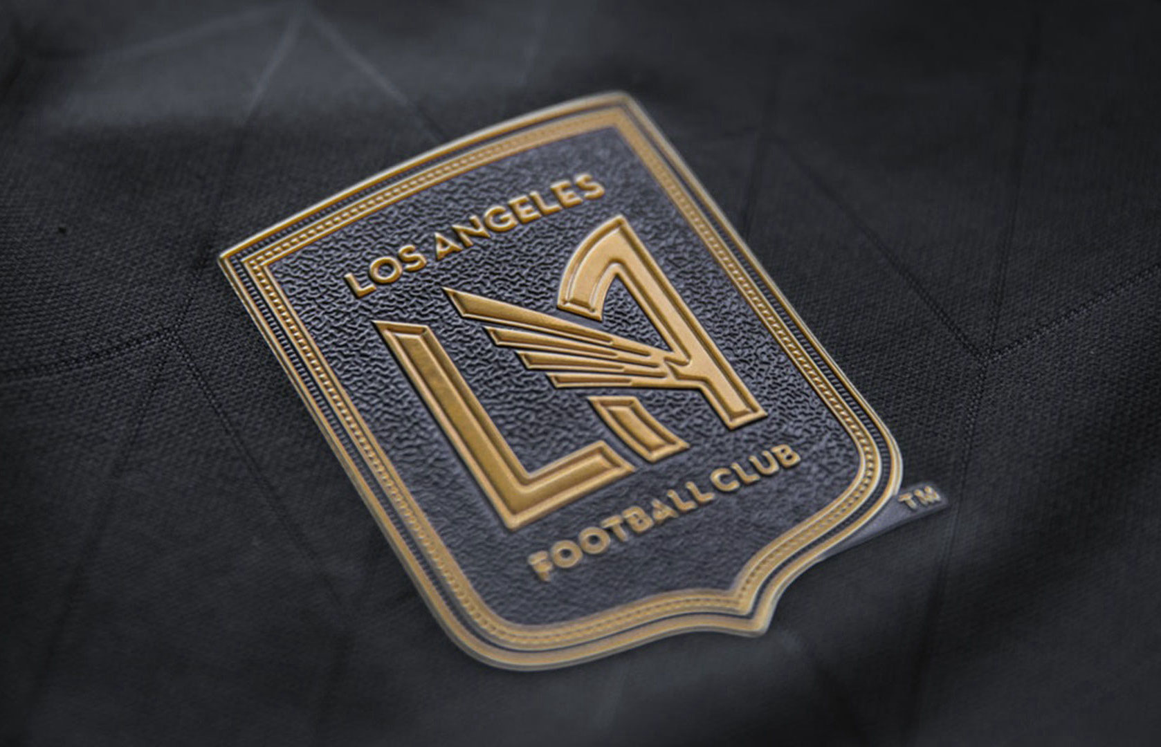
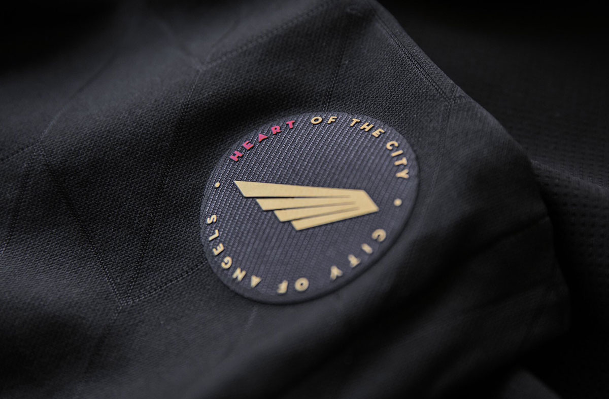
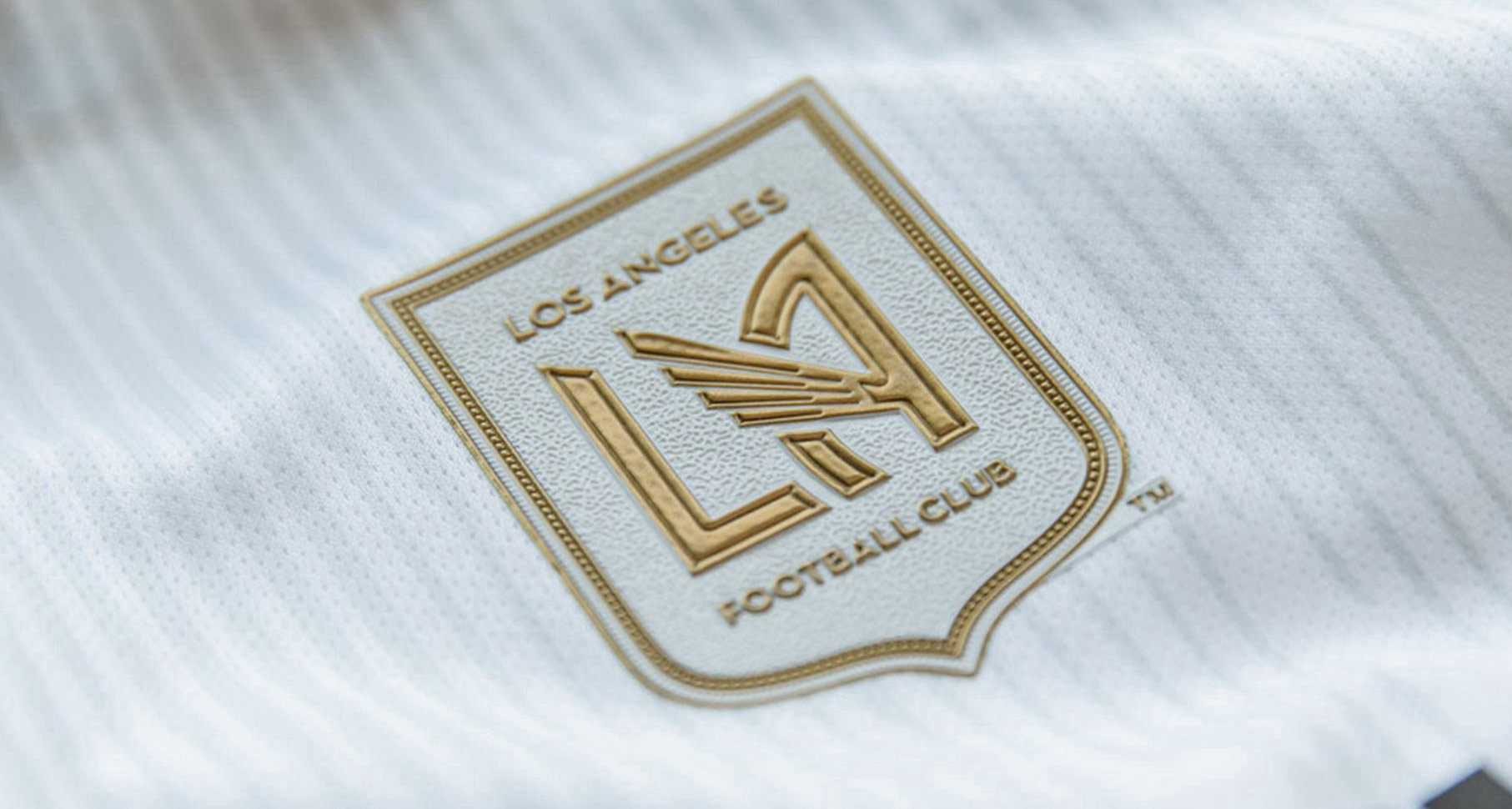
Within the 'LA' monogram is a wing, paying homage to the City of Angels and the city’s Aztec and Mexican heritage. A universal symbol of speed, power, and mobility, the wing is a legendary icon which appears consistently throughout history and across cultures.
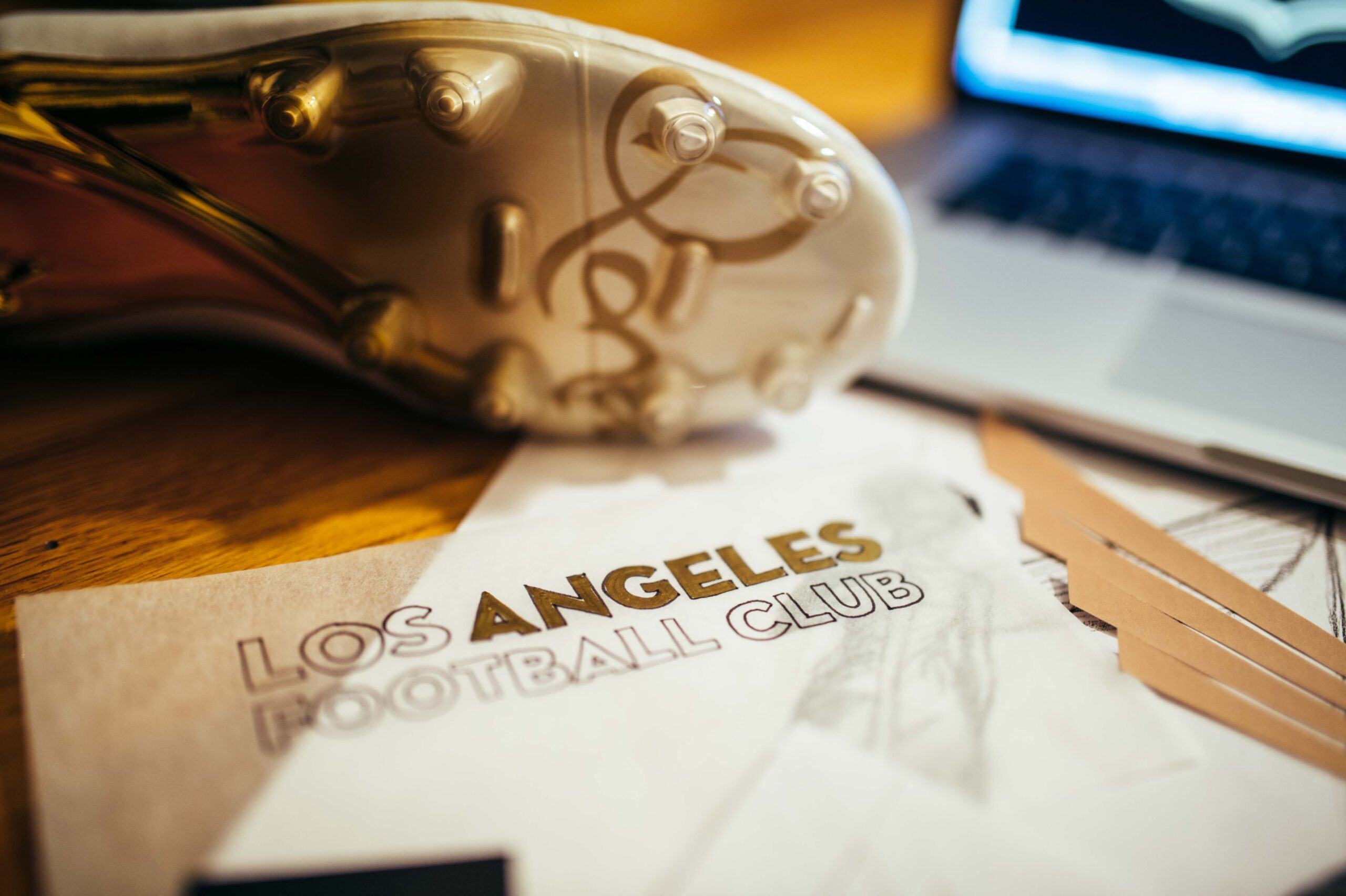
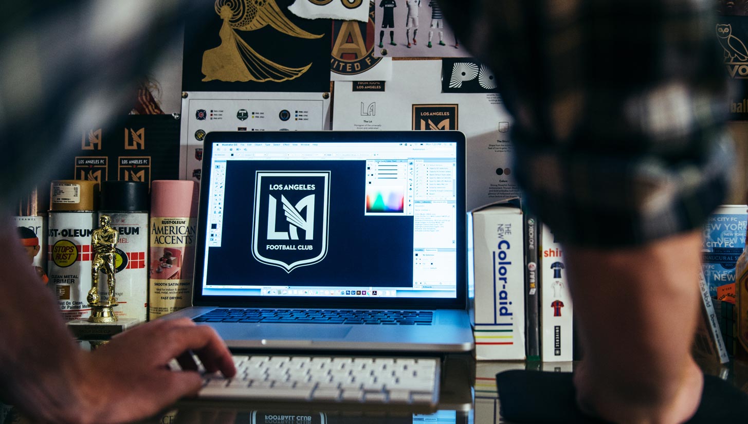
The rest of the visual identity was built around the 'LA' monogram. The shape of the shield is derived from the Seal of the City of Los Angeles. The black and gold color scheme reflects the success, urban texture, and glamor of Los Angeles. The wordmark is set in Neutraface, a versatile Art Deco-inspired typeface that is a nod to downtown Los Angeles’ rich collection of Art Deco buildings.
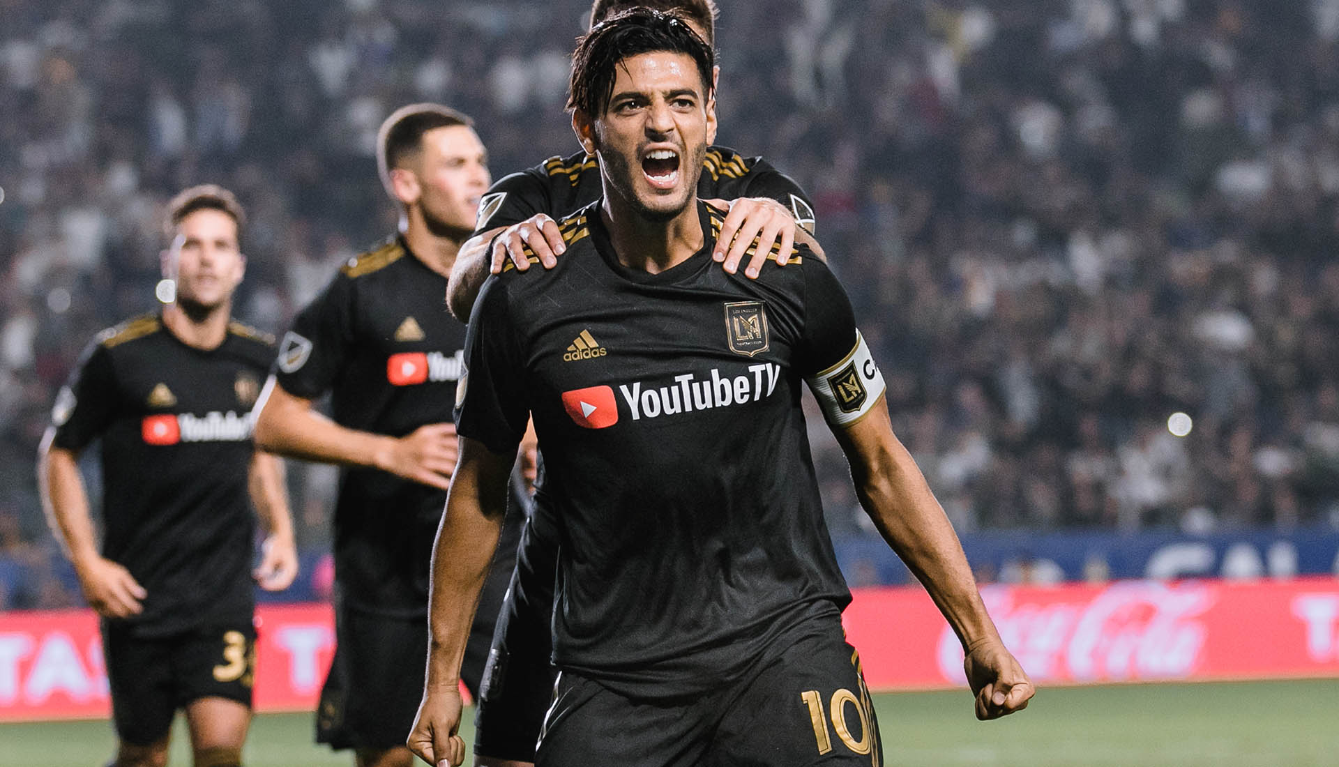
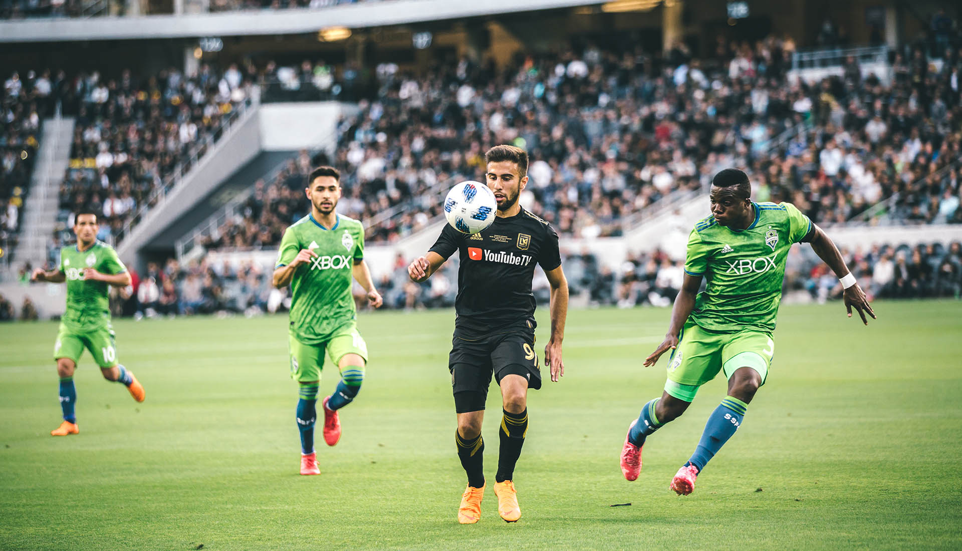
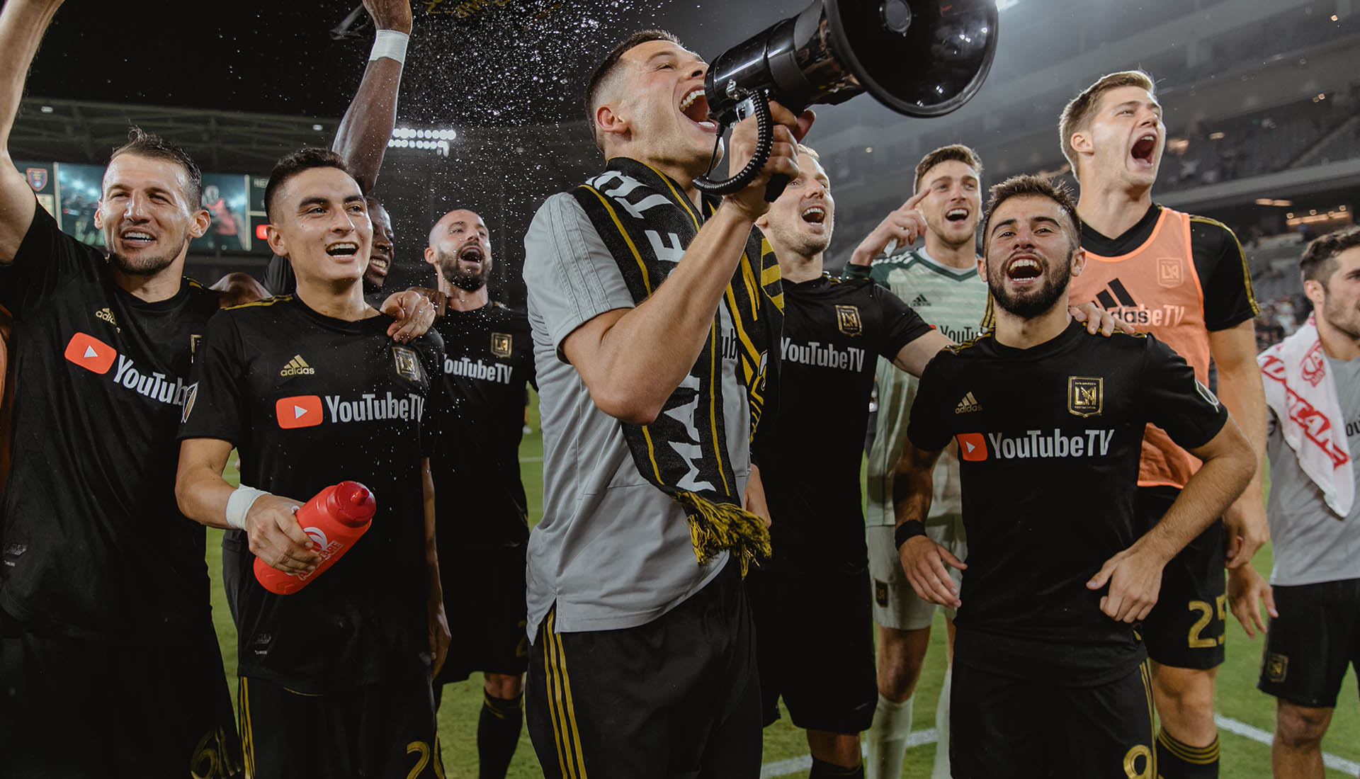
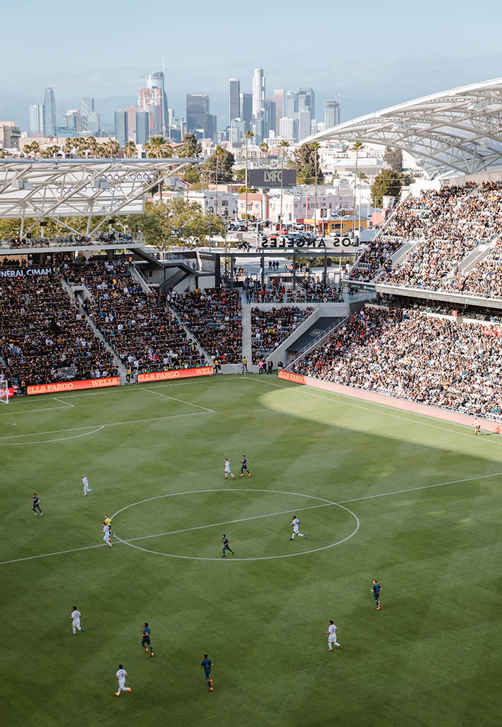
LAFC play their home matches in a state-of-the-art soccer-specific stadium in downtown LA. The club won its first MLS Cup in 2022.
DELIVERABLES
- Primary crest
- Secondary marks
- Color scheme
- Wordmarks
- Kit strategy / creative direction
IN COLLABORATION WITH
Beacon Asia Consulting (formerly known as 'Spark')
LAUNCH DATE
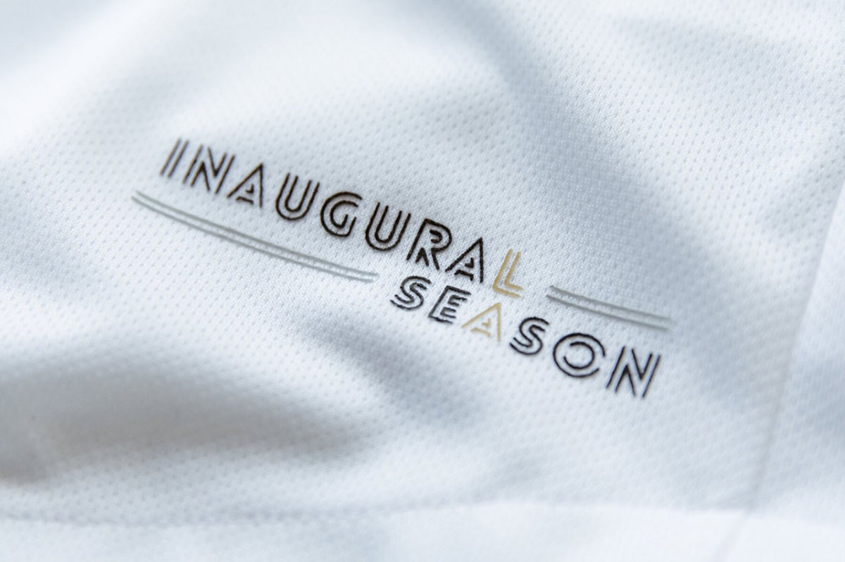
January 2016
MORE WORK